Showing posts with label focal points. Show all posts

Aug 18, 2022

REFERENCE - All about the LINE

 Line is a mark connecting two points; you can consider a line as a moving point.


Types of line

ACTUAL LINE—The line

IMPLIED LINE—An automatically connected series of unconnected points.

PSYCHIC LINE—The placement of the objects causes the viewer to look in a certain direction.


Categories to describe lines
TYPES OF LINE—the way it moves from beginning to end (straight, curves, angular)
LINE DIRECTION—relationship with the page (horizontal, vertical, diagonals)
LINE QUALITY—how the line is draw and the drawing media (delicate or bold, smooth or broken, thick or thin, regular or changing)
Uses of Line • To define shapes (contour drawing/cross-contour)
• To create texture (evoking our sense of touch)
• To create patterns (repetition)
• To create value (parallel lines “hatching” /intersecting lines “cross-hatching” create various density)
• To convey a mood (linear technique)
• To suggest motion (differences in line weight)

Working with lines • Stop/Start
• Change in directions
• Overlap or intersect
• Change in line weight (thick and thin)
• Closer together, farther apart


Oct 14, 2020

Grayscale Portrait or abstract composition w/ B/W Acrylic Paints (refer back to your gray value scales)


Project Description

Project Due on October 19 / October 20

Create a 9" x 12" self-portrait or portrait or abstract composition in B/W (grayscale) Acrylic applying the practice of value scales you just finished doing. Use at least 5-7 gray values from black, dark grays, medium grays light grays, white to create a well executed portrait or abstract design using a good range of gray scale value system.

Have fun with expressions, angles, framing to create a unique image to draw out for your  sketch studies and then you will select the best direction to work on as your final composition. please be be creative. 

avoid blending/shading of paint with this assignment, instead break the image down into shapes that represent the changes in value. You will be creating solid shapes (blocking out fields) each value in the gray value scales. there will be 5-7 value distinctions in the final compositions. 

Be very aware of your placement, layout, figure ground relations, cropping, good framing, interesting angles and vantage points. Be creative in how you create your compositions. Use lighting to create more dramatic shadows, mid tones and highlights. be aware of your light source and how it plays with the details on your face when mapping out the value fields. Create the most dynamic and interesting composition possible. If you need to do more sketches to resolve your piece, you will have to do more studies. 

Have your final composition drawn out on 9" x 12" bristol board, and map and block out all the fields values ranging from black (#5) to white (#1). 

Just in case you need reference. Value Scale Technique - Training Videos to practice learning technique and how to judge values.

https://www.youtube.com/watch?v=WowABJEpm1c

https://www.youtube.com/watch?v=B-jkKJmSW_8

Note: You will receive a full project grade on your homework meaning your sketches and studies. This will be reviewed and graded in class.

Rubric
You will be assessed on the overall composition (dynamic and interesting), craftsmanship (even  surface with good tonal value fields using value as highlights, mid tones and shadows, clean edges on paper, no marks/dirt on paper), and range of value (full range of values from black to white- with at least 5 steps). Use continuous even lights mediums darks shades on each field that you black out. 

Student Examples

May 9, 2018

MIXED MEDIA ASSEMBLAGE/COLLAGE PROJECT – DUE DATE- 5/15 + 5/16, 2018

Purpose
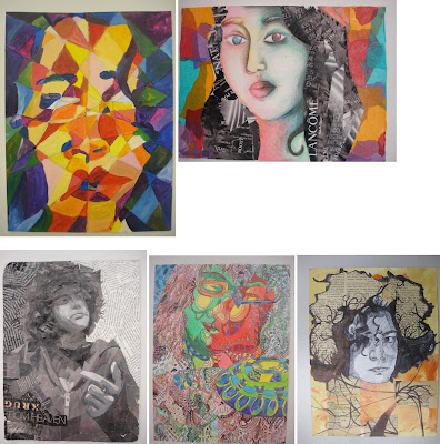
Create two mixed-media portraits or still life on Bristol board or other surface. Think about the theme of your persona or your subject's persona and style on how you will approach the project. This is not about traditional portraiture or just creating a typical still life, it's an interpretation as well, it's your original, unique vision, but it gives you the freedom to find creative solutions to challenge traditional perceptions. Think abstract, deconstruction, mixed media, collaging, material, overlapping, LAYERING and weaving in your elements in creating a strong compositional solution. use your creative mind and create an affective integrated, cohesive series of TWO works of art that challenge the norm. Intergrate! don't treat your materials as seperates. they all must work together. INTEGRATION, NOT SEPARATION.

Two interpretive pieces either alternative portraiture or still life. Through the process, you will begin to explore additive technique in two-dimensional art. In particular, you will experiment with integrating collaging with traditional painting and drawing techniques. MUST BE VISUALLY PLEASING (good aesthetics please). Think and analyze your process, method of execution and explore creative solutions. Be experimental.

Attention will be given to the design principles we covered first semester. Namely: (framing, Scale, Hierarchy (points of interest/focal areas/emphasis), asymmetry, cropping techniques,  Textural look or feel, F/G relationship, balance, composition, value, contrast and color theory/relationships), color palette, asymmetry. All that we have studied thus far is crucial in creating a cohesive unified solution. How will everything tie in together to create a balanced composition. 

This project is treated as an abstraction and interpretive. not to be literal. All elements must work together to create a cohesive (unified), resolved, and finished work. Really think about your approach as in theme, style, be selective with materials and how to work them into your composition. Integrate the materials thinking of overlapping, layering, creating transparency in your finished piece. That can be done with different methods of layering mediums. You really need to analyze your piece and be visually aware of your AESTHETICS.

Due Dates (Critiques)
Mon/Wed Class: Wednesday, May 16th. 
Tues/Thurs Class: Tuesday, May 15th. 

Rubric
You will be assessed on your application of the design principles mentioned above, your creative solution, integration of materials, craftsmanship, composition, execution, sketches, and your creativity. 
Note: All projects turned in after the due-date will be reduced by one letter grade. 

Materials

  • Two Sheets of Bristol board or  other surfaces 9" x 12" 
  • Paint, markers, colored pencils, charcoal, watercolors, etc.
  • Fabric scraps, tissue paper, magazine cutouts, string, yarn, newspaper, etc.
  • Appropriate adhesive (white glue, rubber cement, gel medium, sewing kit)

Process

Step 1
In your sketchbook, create 3 different contours (silhouettes) or whatever subject matter you choose that you will use as a reference for your collage. Themes can be a deconstructed portraiture, figurative, still life, abstract environment. BUT ALL ELEMENTS OF MEDIUMS AND MATERIALS MUST BE INTEGRATEAD, WEAVED INTO EACHOTHER, OVERLAPPING, INTERSECTING. MAKE IT A UNIFIED COMPOSITION. NOT COMPARMENTALISED. ELEMENTS MUST BE INTERGRATED NOT SEPERATED. MUST ALL WORK AS A WHOLE! THE SOME OF ALL PARTS. TOGETHER. FLOW, UNITY, COHESIVE. MUST WORK AS A PAIR.

PLEASE STUDY THE LINKS AND ARTIST LISTED. GIVES YOU IDEAS AND RESEARCH MATERIALS. POINTS OF REFERENCE. PLEASE!!!!

Begin by mapping out a theme/concept, think about materials, color palette, MAIN MATERIALS, your layout for both pieces, their relationships. what will crossover be? what is the common ground of your visuals, etc... Pay close attention to details, such as facial features or objects for still life. framing is important! and their relative size and position to one another. Be sure to map all these elements out correctly. Use cropping, scale and position on paper to create a dynamic composition.

Draw a silhouette of the head, then include neck and shoulders, add hair, include ears... Think about what you could add/remove to make it unique (pencil behind ear, sunglasses in hair, specific earring, etc). of course this also applies to a still life and all of its accents. whats the environment? look at Braque and Picasso JOSEPH CORNELL ASSEMBLAGES/collages. 

Process to consider when creating your mixed media composition. Think abstract. Think creative. deconstruct. think of creating focal areas and how your eye travels through the piece. WHAT ARE THE FOCAL AREAS? MAIN SUBJECT, SECONDARY TERTIARY FOCAL AREAS. Must have emphasis. things can't have equal importance on your canvas. there will always be a main subject. can't have everything same size, same value, same anyting. have to keep it DYNAMIC!

Step 2
Focus on other areas of your body as an option- hands, feet, legs, and entire figure. Repeat the steps above, to create 5 more contours from these observational drawings. 

Step 3
Tape the composition to a wall, take a step back, and examine all contours area of composition and theme. Examine the positive/negative space, and composition, of each contour. What is successful. SQUINT.

Now, look at the compositions alongside each other. Pay attention to the different ways the compositions interact with each other. How do they inform (relate and influence) each other? What combinations of compositions are particularly successful? WHAT IS THE FOCAL AREAS? MAIN SUBJECT, SECONDARY TERTIARY FOCAL AREAS. 

Step 4
Based on the observations in Step 3, choose one (or more) compositions to use as a starting point. Find ways to make the composition stronger, by overlapping, intersecting, combining, cutting, cropping, sewing stitching, glueing, etc.  Continue to refine the composition by rearranging, adding, and deleting elements.

Step 5
Explore with different materials (paint, collage, markers, fabric, metal, etc), continuing to refine the composition. Use color, texture, and value to tie everything together. 

NOTE: THIS IS NOT A 3-D PROJECT; KEEP THE WORK 2-D.It can have lots of texture,  alittle relief 1/8" and some depth, but the base board must be able to physically support all the materials you have incorporated. 

Research the words: Assemblage, Mixed-Media, Collage. below are other references.

Art-Historical Examples


Students Samples


Aug 29, 2017

REFERENCE – ALL ABOUT THE LINES

Line is a mark connecting two points; you can consider a line as a moving point.

Types of line

ACTUAL LINE—The line

IMPLIED LINE—An automatically connected series of unconnected points.

PSYCHIC LINE—The placement of the objects causes the viewer to look in a certain direction.


Categories to describe lines
TYPES OF LINE—the way it moves from beginning to end (straight, curves, angular)
LINE DIRECTION—relationship with the page (horizontal, vertical, diagonals)
LINE QUALITY—how the line is draw and the drawing media (delicate or bold, smooth or broken, thick or thin, regular or changing)
Uses of Line • To define shapes (contour drawing/cross-contour)
• To create texture (evoking our sense of touch)
• To create patterns (repetition)
• To create value (parallel lines “hatching” /intersecting lines “cross-hatching” create various density)
• To convey a mood (linear technique)
• To suggest motion (differences in line weight)

Working with lines • Stop/Start
• Change in directions
• Overlap or intersect
• Change in line weight (thick and thin)
• Closer together, farther apart


Apr 27, 2017

NON-PROPORTIONAL COLOR INVENTORY - DEADLINE: Wednesdaay, May 3 / Thursday, May 4

Create a well balanced abstract composition or interpretive portrait (color blocked) or creative landscape (consider foreground, middle ground, background). For all compositions, consider focal areas (emphasis, hierarchy), use all sides of page (edge to edge) when framing and cropping, assymetry, Figure/Ground relationships! don't put subjet in middle. Dynamic composition.

You selected your image. Analyze the overall color palette used and take an inventory of specific hues found in the image you are extracting color from. You must have at least 10-15 found colors to use from the reference art that you selected (create an inventory list). Break away from the colors you like and start training the eye to assess color objectively. Find color combinations that you might not otherwise consider and learn the ability to represent the countless tones of a visual source.

Create at least 3 sketches (showing color distribution), well balanced, creative composition. in your sketchbook as well, analyze and start applying colored areas in your sketches as a visual reference. use acrylic or watercolor on your drafts in your sketchbook preferably around the 6"x6" area you will be using as your square color palette. Practice some color mixing with the palette you selected to figure out the division how to mix the exact colors. Think about how the colors will interact in your composition. When mapping it out your colors, use light pencil to visualize color placement.

Materials
• Bristol board, 9x12"
• reference painting (from art books in closet)
• 6"x6" bristol square for swatch of colors
• All 3 pieces to be mounted on matte board (Reference Painting, color swatches, Final Composition)

Process
Find several pages from magazines, art reproductions, Paintings with color combinations that you usually don't use. You are going to create a non-proportional color inventory taking a careful inventory of the colors seen in the painting and mixing each color to match the original color in the your source image. Examine, analyze and map out the colors as well as thinking of your composition. you will create at least 3 sketches of ideas for composition. Be very aware of the areas of color placement, always considering values, contrast, highlights in composition. check hierarchy, focal areas, mapping out the colors you identified and where they will be used in painting with new color palette.

YOU WILL BE GRADED ON ALL STEPS OF THIS PROJECT. 

CREATING A NON-PROPORTIONAL INVENTORY
Make a non-proportional inventory with uncountable number of tones (images taken from the natural world or complex paintings are good sources) you will have to average out the main colors in the painting. Begin the inventory with a square of flat color, (about 6" X "6 inches) use a background color directly from the image. Try to match the colors you observe precisely, create between 10 and 15 different dots. Design a composition of your own using tones drawn from the non-proportional inventory.


Students' samples
 

Apr 8, 2017

MIXED MEDIA ASSEMBLAGE/COLLAGE PROJECT – DUE DATE- 4/17 + 4/18

Purpose
Create two mixed-media portraits or still life on Bristol board. Think about the theme of your persona or your subject's persona and style on how you will approach the project. This is not about traditional portraiture or just creating a typical still life, it's an interpretation as well, it's your original, unique vision, but it gives you the freedom to find creative solutions to challenge traditional perciptions. think abstract, deconstruction, mixed media, collaging, material, overlapping, LAYERING and weaving in your elements in creating a strong compositional solution. use your creative mind and create an affective integrated, cohesive series of TWO works of art that challenge the norm. Intergrate! don't treat your materials as seperates. they all must work together. INTEGRATION, NOT SEPARATION.

Two interpretive pieces either alternative portraiture or still life. Through the process, you will begin to explore additive technique in two-dimensional art. In particular, you will experiment with integrating collaging with traditional painting and drawing techniques. MUST BE VISUALLY PLEASING (good aesthetics please). Think and analyze your process, method of execution and explore creative solutions. Be experimental.

Attention will be given to the design principles we covered first semester. Namely: (framing, Scale, Hierarchy (points of interest/focal areas/emphasis), asymmetry, cropping techniques,  Textural look or feel, F/G relationship, balance, composition, value, contrast and color theory/relationships), color palette, asymmetry. All that we have studied thus far is crucial in creating a cohesive unified solution. How will everything tie in together to create a balanced composition. 

This project is treated as an abstraction and interpretive. not to be literal. All elements must work together to create a cohesive (unified), resolved, and finished work. Really think about your approach as in theme, style, be selective with materials and how to work them into your composition. Integrate the materials thinking of overlapping, layering, creating transparency in your finished piece. That can be done with different methods of layering mediums. You really need to analyze your piece and be visually aware of your AESTHETICS.

Due Dates (Critiques)
Mon/Wed Class: Monday, April 17th. 
Tues/Thurs Class: Tuesday, April 18th. 

Rubric
You will be assessed on your application of the design principles mentioned above, your creative solution, integration of materials, craftsmanship, composition, execution, sketches, and your creativity. 
Note: All projects turned in after the due-date will be reduced by one letter grade. 


Materials

  • Two Sheets of Bristol board 14in. x 12in. or bigger
  • Paint, markers, colored pencils, charcoal, watercolors, etc.
  • Fabric scraps, tissue paper, magazine cutouts, string, yarn, newspaper, etc.
  • Appropriate adhesive (white glue, rubber cement, gel medium)

Process

Step 1
In your sketchbook, create 3 different contours (silhouettes) that you will use as a reference for your collage. Themes can be a deconstructed portraiture, figurative, still life, abstract environment. BUT ALL ELEMENTS OF MEDIUMS AND MATERIALS MUST BE INTEGRATEAD, WEAVED INTO EACHOTHER, OVERLAPPING, INTERSECTING. MAKE IT A UNIFIED COMPOSITION. NOT COMPARMENTALISED. ELEMENTS MUST BE INTERGRATED NOT SEPERATED. MUST ALL WORK AS A WHOLE! THE SOME OF ALL PARTS. TOGETHER.

Begin by mapping out a theme/concept, think about materials, color palette, MAIN MATERIALS, your layout for both pieces, their relationships. what will crossover be? what is the common ground of your visuals, etc... Pay close attention to details, such as facial features or objects for still life. framing is important! and their relative size and position to one another. Be sure to map all these elements out correctly. Use cropping, scale and position on paper to create a dynamic composition.

Draw a silhouette of the head, then include neck and shoulders, add hair, include ears... Think about what you could add/remove to make it unique (pencil behind ear, sunglasses in hair, specific earring, etc). of course this also applies to a still life and all of its accents. whats the environment? look at Braque and Picasso JOSEPH CORNELL ASSEMBLAGES/collages. 

Process to consider when creating your mixed media composition. Think abstract. Think creative. deconstruct. think of creating focal areas and how your eye travels through the piece. WHAT ARE THE FOCAL AREAS? MAIN SUBJECT, SECONDARY TERTIARY FOCAL AREAS. Must have emphasis. things can't have equal importance on your canvas. there will always be a main subject. can't have everything same size, same value, same anyting. have to keep it DYNAMIC!

Step 2
Focus on other areas of your body- hands, feet, legs, and entire figure. Repeat the steps above, to create 5 more contours from these observational drawings. 

Step 3
Tape the composition to a wall, take a step back, and examine at your contours. Examine the positive/negative space, and composition, of each contour. What is successful. SQUINT.

Now, look at the compositions alongside each other. Pay attention to the different ways the compositions interact with each other. How do they inform (relate and influence) each other? What combinations of compositions are particularly successful? WHAT IS THE FOCAL AREAS? MAIN SUBJECT, SECONDARY TERTIARY FOCAL AREAS. 

Step 4
Based on the observations in Step 3, choose one (or more) compositions to use as a starting point. Find ways to make the composition stronger, by overlapping, intersecting, combining, cutting, cropping, etc.  Continue to refine the composition by rearranging, adding, and deleting elements.

Step 5
Explore with different materials (paint, collage, markers, fabric, metal, etc), continuing to refine the composition. Use color, texture, and value to tie everything together. 

NOTE: THIS IS NOT A 3-D PROJECT; KEEP THE WORK 2-D.It can have lots of texture, and some depth, but the bristol board must be able to physically support all the materials you have incorporated. 

Research the words: Assemblage, Mixed-Media, Collage. below are other references.

Art-Historical Examples


Students Samples


Aug 30, 2016

REFERENCE - All about the LINE

Line is a mark connecting two points; you can consider a line as a moving point.

Types of line

ACTUAL LINE—The line

IMPLIED LINE—An automatically connected series of unconnected points.

PSYCHIC LINE—The placement of the objects causes the viewer to look in a certain direction.


Categories to describe lines
TYPES OF LINE—the way it moves from beginning to end (straight, curves, angular)
LINE DIRECTION—relationship with the page (horizontal, vertical, diagonals)
LINE QUALITY—how the line is draw and the drawing media (delicate or bold, smooth or broken, thick or thin, regular or changing)
Uses of Line • To define shapes (contour drawing/cross-contour)
• To create texture (evoking our sense of touch)
• To create patterns (repetition)
• To create value (parallel lines “hatching” /intersecting lines “cross-hatching” create various density)
• To convey a mood (linear technique)
• To suggest motion (differences in line weight)

Working with lines • Stop/Start
• Change in directions
• Overlap or intersect
• Change in line weight (thick and thin)
• Closer together, farther apart