Mon/Wed Class: November 7, 2016
Tues/Thurs Class: November 10, 2016
IMPORTANT: You will do another series of three 6"x7" during the holiday break.
Both series of 3 designs will be presented for JURIES.
You will be graded on understanding of how to use color wheel and and it's color relationships, creativity, aesthetics, craftsmanship, use of color variations, range of values, Focal areas (at least 3 points of interest where your eyes travel, hierarchy of shapes in your design, harmony, unity, balance, etc…
• Create a series of 3 dynamic compositions (3 of the same).
• SELECT 3 DIFFERENT COLOR RELATIONSHIPS from The COLOR WHEEL
for EACH design.
• Each of the 3 Composition is repeated 3 times with the same design.
• The color relationships chosen by you will change on each 6x7 drawing.
• Write down your 3 final color relation selections and their proper colors on back of page.
• Creativity, aestheitcs, Clean edges/ brush strokes , solid flat colors, no shading.
Analogous
Monochromatic
Complimentary
Double complimentary
Split complimentary
Triadic.
Select an image or close up of image from nature that has detailed areas of interest where you can see different design elements in the shapes of the image. Composition can be inspired from your own mind or inspired from the shapes of images that exist in nature. Look at the details. explore, look beyond just the simple image of, i.e… a flower. Deconstruct the shapes and details, make them work together, interpret the shapes and use elements to create your own design. Nature has many dynamic shapes that can inspire ideas. recreate your own version. You can use cropping L's or form a square with your hands to focus in and search for select areas in the image. The cropping is to show how scale works in relation to the page size which is 6"x7". Look beyond the actual literal image and interpret the shapes and apply to your drawing. Be creative and inspired.
You will be creating three of the same compositions with 3 different color relationships.
THREE (3) Color Relationship Studies will be chosen from the CLASSIC Color Wheel.
ALL questions can be answered from these links below.
PLEASE READ AND RESEARCH!
Create three repetitive compositions on 6”x 7” paper using three different color relationships from the color wheel. Repeat same composition on each one. Using paints, execute your compositions using your chosen color relationships, use the pure saturated colors and their values mixing white only to create different mid-tones and lighter values of that color (the tints). think of value of color. you may use white only to lighten the colors. do not use black or mix colors to create any muted tones, neutrals etc… ONLY FROM MAIN COLOR WHEEL.
To choose your color relationship, you will select your main hue as starting point and from that point, you will analyze and develop its relationships according to the color wheel. YOU must refer to the color wheel and the examples from the different combinations from the color wheel posted from the blog. Go back to the reference material on the color theory chapter of the blog. YOU MUST LEARN THE COLOR WHEEL AND ALL ITS RELATIONSHIPS.
You must respect the color relationships that are created from the main hue chosen. DO not deviate from the color selections. Where do the colors fall when using each relationship. you are to stick to them but can use pure color and incorporate the shades, tones and tints of that particular hue.
Process / RECAP
• Sketch out 4 thumbnails for your desired composition. Experiment with pencil and play with color
in your sketchbook so you can explore different relationships and color combinations.
• Select the strongest composition to execute your final 6”x 7” painting.
• Redraw the design three times and map out where the colors will be placed and different values
Again you will be graded on understanding of color wheel and and its color relationships, creativity, aesthetics, craftsmanship, use of color, range of values, Focal areas (points of interest) hierarchy in your design, harmony within the composition. Clean edges, solid, flat colors, no shading. brush strokes.
Materials
• White Bristol 6”x7” format (3 final paintings)
• Paint from the pure saturated colors including the tints mid-tones tones. no blending. well defined shapes, clean edges.
• Mounted as a series on white or black board, centered, with 1" margins
• Mounted as a series on white or black board, centered, with 1" margins
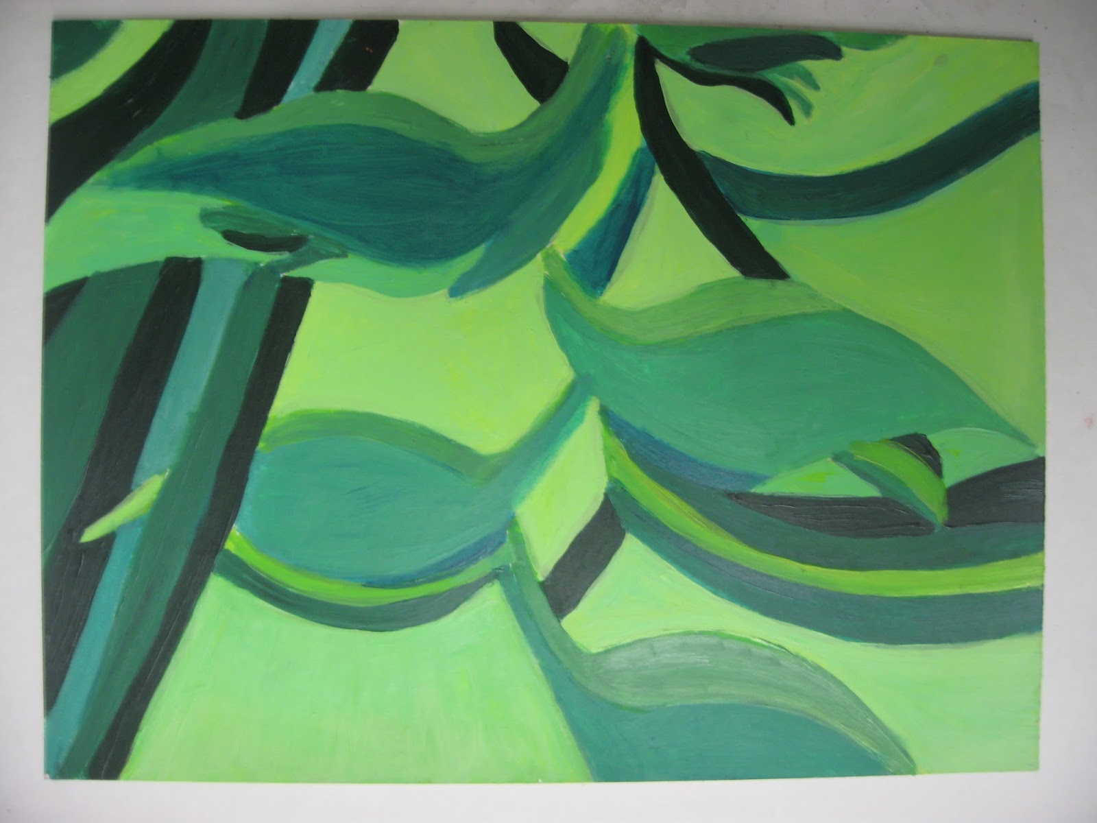
Students Samples:
Focus on the individual compositions. look at repetition and the different color selections and how they are used. This is past work from prior 9th grade classes. Study them.


Focus on the individual compositions. look at repetition and the different color selections and how they are used. This is past work from prior 9th grade classes. Study them.