
The chart and definitions below introduce the four basic levels of saturation

PRISMATIC COLORS
are as pure in hue as is possible with pigments. Once a pure color has been altered through color mixing, it ceases to be prismatic (except when the admixture is a closely related hue, as when mixing yellow-orange into yellow).
are as pure in hue as is possible with pigments. Once a pure color has been altered through color mixing, it ceases to be prismatic (except when the admixture is a closely related hue, as when mixing yellow-orange into yellow).
MUTED COLORS
range from rich colors that lie just outside the prismatic zone, to the most saturated chromatic grays. One can create muted colors by adding black, white, or gray to a prismatic color. Adding the complement of a hue will also diminish its saturation and produce
range from rich colors that lie just outside the prismatic zone, to the most saturated chromatic grays. One can create muted colors by adding black, white, or gray to a prismatic color. Adding the complement of a hue will also diminish its saturation and produce
muted color.
CHROMATIC GRAYS
exhibit a subtle, yet discernible hue. Except for the proportions involved, they are mixed in exactly the same manner as muted colors. Chromatic grays simply require larger quantities of black, white, gray, or the complementary hue. The color is being stripped away. It is the dullest color before going gray in any value.
exhibit a subtle, yet discernible hue. Except for the proportions involved, they are mixed in exactly the same manner as muted colors. Chromatic grays simply require larger quantities of black, white, gray, or the complementary hue. The color is being stripped away. It is the dullest color before going gray in any value.
ACHROMATIC GRAYS
compose the inner circle of the color wheel. Grays mixed from black and white are achromatic because, like black and white, they lack perceptible hue and saturation. Achromatic grays can also be produced by precisely intermixing two complementary colors so that each hue cancels the other our. Insofar as a gray registers the slightest amount of perceptible hue it should be considered a chromatic gray.
BELOW ARE SAMPLES OF COLOR CHARTS BELOW SHOWING PROCESS OF LEVELS OF TRANSFORMATION FROM A PURE SATURATED HUE DOWN TO CHROMATIC GRAYS. BE AWARE OF EACH HUE (CHROMA) RANGE OF VALUES FROM LIGHTS TO DARKS.
Pay attention to the gray value scale as a guide to applying the different value shifts in each hue. IMPORTANT to compare grayscale value in relation to value in hue.


Your compositions will be painted in acrylic, using limited palette of 3-4 different pure hues (selected from color wheel. Different values of each hue should be used to show illusion of dimension within your composition. must remain high chroma. so that may mean using a little white or yellow and yellow-orange as your lighter colors for highlights.
Remember, contrast and objects should be used to establish areas of interest (focal points). Also, be aware of light, darks, and mid tones. You can reference the value scale projects from the beginning of the year.
EXERCISES IN CREATING COLOR SWATCHES MUST BE PUT INTO PRACTICE IN SKETCHBOOK IN ORDER TO UNDERSTAND THE PROCESS AND THE GRADUAL SHIFTS FROM MUTED TO CHROMATIC GRAY. YOU ARE GOING FROM PURE SATURATED AND GRADUALLY TAKING COLOR AWAY TO REACH GRAY WITH ALITTLE HINT OF ITS HUE.
This is to be strategically applied to the composition exercises you are creating in class. Must follow each color you apply and all in keeping the value and contrast in each composition
You must apply the appropriate use of chroma consider range of values and contrast, different levels of muted hues for your composition. Use the muted composition as a guide to following the same hues and same values but using a chromatic gray palette.
Result:
There will be a total of 2 sets of compositions produced in class. (4 total) Each set will use TWO of the same compositions, same chroma, same values.
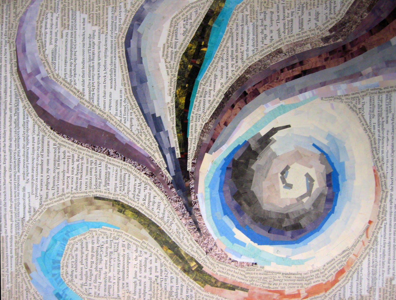
Student Samples


compose the inner circle of the color wheel. Grays mixed from black and white are achromatic because, like black and white, they lack perceptible hue and saturation. Achromatic grays can also be produced by precisely intermixing two complementary colors so that each hue cancels the other our. Insofar as a gray registers the slightest amount of perceptible hue it should be considered a chromatic gray.
BELOW ARE SAMPLES OF COLOR CHARTS BELOW SHOWING PROCESS OF LEVELS OF TRANSFORMATION FROM A PURE SATURATED HUE DOWN TO CHROMATIC GRAYS. BE AWARE OF EACH HUE (CHROMA) RANGE OF VALUES FROM LIGHTS TO DARKS.
Pay attention to the gray value scale as a guide to applying the different value shifts in each hue. IMPORTANT to compare grayscale value in relation to value in hue.


Project Description
Exersice based on using high chroma (saturated pure colors and gradually muting the same colors down maintaining its values and contrast until they are gray with slight chroma and final will be grayscale.
Paper size: 9 x 12 inches. You will produce 4 paintings in total.
Paper size: 9 x 12 inches. You will produce 4 paintings in total.
This is an in-class project. You will create at least 7 thumbnails sketches (in sketchbook) during class time. This is a graded studio assignment. Consists of 5-7 minute sessions per sketch of small still life aranged per table by you all. You should shift to render variety of angles of the still life or change your location to other arrangements to resolve your composition adequately. The final selected composition will be drawn out twice, using two sheets of bristol board (9" x 12"). Be as precise as possible, to make both compositions the same. You can use a grid to help layout the 2nd composition.
When deciding on the aesthetics of your composition, required to use cropping, scaling, proportions, zooming in to see shapes instead of the actual literal objects. These methods will allow you to develop an asymmetrical balance that considers both the foreground and background (figure/ground relationship). USE ENTIRE PAGE. at least 3 items that you will scale up to be in proportion to your page like in audtions. not too detailed. it will be all color blocking (solid flat colors) and mapping out areas of highlights and to show dimension using acrylic paint.(VERY IMPORTANT TO TAKE NOTES ON THE PAINT COLOR AND MANUFACTURER. i.e. all blues blacks, yellows etc... do not have the same properties.
When deciding on the aesthetics of your composition, required to use cropping, scaling, proportions, zooming in to see shapes instead of the actual literal objects. These methods will allow you to develop an asymmetrical balance that considers both the foreground and background (figure/ground relationship). USE ENTIRE PAGE. at least 3 items that you will scale up to be in proportion to your page like in audtions. not too detailed. it will be all color blocking (solid flat colors) and mapping out areas of highlights and to show dimension using acrylic paint.(VERY IMPORTANT TO TAKE NOTES ON THE PAINT COLOR AND MANUFACTURER. i.e. all blues blacks, yellows etc... do not have the same properties.
Your compositions will be painted in acrylic, using limited palette of 3-4 different pure hues (selected from color wheel. Different values of each hue should be used to show illusion of dimension within your composition. must remain high chroma. so that may mean using a little white or yellow and yellow-orange as your lighter colors for highlights.
Remember, contrast and objects should be used to establish areas of interest (focal points). Also, be aware of light, darks, and mid tones. You can reference the value scale projects from the beginning of the year.
Important
Each of the two compositions must maintain the same relative values, and shapes. They are to be the same in terms of color, shape, value and contrast. The only difference: one will be Prismatic (high saturation, Pure hue, and the other will be toned down, Muted, duller.
CRAFTSMENSHIP IS OF UTMOST IMPORTANCE. BE FOCUSED AND METICULOUS. smooth and consistent paint strokes.
When you mix your paints to created muted hues, think of a broad value range that extends from lights to darks. you will tone down the hues by using the complemtary to adjust the shift in your pure colors (hues) to reach the muted hue and to get the proper tints, tones, shades. For this assignment, always mix your colors with gradual very small amounts of the complementary. may have to add hints of white to maintian the lights. you will have to be aware of value and add white to get the right value and level of saturation. Its important to learn to produce muted colors by using its complementary color. That is more challenging but will give you better results and truer color shift.
When painting, be sure to block out your colors, and keep the colors flat solid even to express illusion of dimension (no brush strokes, shading, gradients).
CRAFTSMENSHIP IS OF UTMOST IMPORTANCE. BE FOCUSED AND METICULOUS. smooth and consistent paint strokes.
Process
Homework:
Study and practice in sketchbook painting swatches going from the pure color and adding slight levels of grays or minimal amounts black and white or its comlemenatry to adjust the color desaturation when you remove more color to achieve muted colors and chromatic grays. you have to be very aware of the shifts in color saturation the level of value (refer back to your value scale exercise. do not be heavy handed and be aware that dark colors and black are very strong pigments. be gentle and careful. if not you will ruin the color porperties and lose the the sublteties on color changes.
40 mins- Prepare 7-10 thumbnails of composition ideas in your sketchbook.
40 mins- Draw out your 2 compositions on the bristol board.
Project executed in Class:
Project executed in Class:
You wil paint and finish in each class. Prismatic (saturated) composition, muted composition, chromatic gray composition and achromatic composition. 4 in total.
3:30 Clean-up and students turn in projects. Name should be on back.
First set 2 paintings
one using Prismatic palette.
one using muted palette.
second set of 2 paintings (different compositions)
one using chromatic gray palette.
one using achromatic gray palette.
one using Prismatic palette.
one using muted palette.
second set of 2 paintings (different compositions)
one using chromatic gray palette.
EXERCISES IN CREATING COLOR SWATCHES MUST BE PUT INTO PRACTICE IN SKETCHBOOK IN ORDER TO UNDERSTAND THE PROCESS AND THE GRADUAL SHIFTS FROM MUTED TO CHROMATIC GRAY. YOU ARE GOING FROM PURE SATURATED AND GRADUALLY TAKING COLOR AWAY TO REACH GRAY WITH ALITTLE HINT OF ITS HUE.
This is to be strategically applied to the composition exercises you are creating in class. Must follow each color you apply and all in keeping the value and contrast in each composition
You must apply the appropriate use of chroma consider range of values and contrast, different levels of muted hues for your composition. Use the muted composition as a guide to following the same hues and same values but using a chromatic gray palette.
Result:
There will be a total of 2 sets of compositions produced in class. (4 total) Each set will use TWO of the same compositions, same chroma, same values.
Things to consider
This study should help you learn to see how light works in nature, and how light is reflected off objects.
The following generalizations are often observed throughout the day. for example to undrstand more:
The following generalizations are often observed throughout the day. for example to undrstand more:
Mid Day- Nice bright prismatic colorsHIgh saturation, high chroma
Early Morning- nice muted colors, hazy pastels, softer,duller, lights to darks
Early Morning- nice muted colors, hazy pastels, softer,duller, lights to darks
Dusk- or cloudy weather: darker muted colors and chromatic grays. color is stripped of it's saturation. can also have broad value range.
Student Samples


