Showing posts with label color relationships. Show all posts

Oct 18, 2021

COLOR RELATIONSHIP COMPOSITIONS USING COLOR WHEEL (COLOR THEORY)

 DUE DATES: Monday/Tuesday, October 25th / 26th 

Create a series of two dynamic compositions on 9"x12" paper.  Choose two different combinations from COLOR RELATIONSHIPS on the color wheel for your compositions.  you must use the pure color and its tints (mixing color with white) for value changes and contrast. Please sketch 4 different design directions and select 2 final designs to work on final painting. If you don't have paints, use color pencils, colored markers or oil pastels.

Next: Select 2 different color relationships from the 6 choices below (reference info below). Identify the color relationship and the original hues and write the information on the back of each composition.

Formal color relationships: 
analogous, monochromatic, triad
complimentary, split complimentary, double complimentary

Subject can be interpretive still life (close up) or inspire yourself with images from nature, anything that has interesting details you can reference to build your concepts. You will be required to find a close up of image from nature or other non-representational elements that has detailed areas of interest where you can see different design elements in the shapes of the image. This an abstraction/interpretive composition.

It can be inspired from your own creativity or from the shapes of images that exist in nature. Look at the details. explore, look beyond just the actual image of, i.e…  a flower, leaves, shattered glass, grid systems, water, etc... Deconstruct the shapes and details, make them work together, reconstruct, interpret the shapes and create your own design. Nature has many dynamic shapes that can inspire ideas. Interpret and recreate your own version.

You can use cropping  by forming a rectangle with your hands to focus in and frame your selected areas in the image. The cropping is to show how crop and isolate subject or scaling up or down works in relation to the page size.

When creating compositions think of asymmetry, use variations in size of shapes (small, medium, large), you should use a broad range of values using a little white to create contrast, use flat colors, solid colors. create focal areas, unity, flow, cohesive, Use your judgement on Aesthetics and provide creative visual solutions please. Be creative and inspired.

Select your main hue as starting point and from there, you will see relationships according to the color wheel. YOU must refer to the color wheel and the examples from the different combinations from the color wheel posted from the blog. Go back to the reference material on the color theory chapter of the blog. YOU MUST LEARN THE COLOR WHEEL AND ALL ITS RELATIONSHIPS.

Start anywhere on the color wheel, Select a key color. but you must respect the color relationships that are created from the main hue chosen. DO NOT deviate from the color selections. DO NOT use black. you can only use white to shift the values of hues. Where do the colors fall when using each relationship. you are to stick to them but can use pure color and incorporate tones and tints of that particular hue.

    - Complimentary colors
    - Split Complimentary colors
    - Double Complimentary colors
    - Analogous colors - Colors next to each other on the color wheel
    - Monochromatic colors
    - Triad

RUBRIC:
You will be graded on understanding of how to use color wheel and and it's color relationships, creativity, aesthetics, craftsmanship, use of color variations, use of values, hierarchy of shapes in your design, harmony within the composition. Clean edges, solid, flat colors, no blending, clean edges, Clean brush strokes. Be clean and neat.

Materials
• White Bristol 9”x12” format (4 final repeating paintings)
• DO NOT USE BLACK. you can use white to create shift in value.

Check Georgia O’Keefe's work

Students Samples:

Focus on the individual compositions. look at repetition and the different color selections and how they are used. This is past work from prior 9th grade classes. Study them.


IMPORTANT: You will be responsible for an additional series of three 9"x12" during the holiday break. Both series of 3 designs will be presented for JURIES.


Oct 30, 2020

REFERENCE: The Color Wheel / Color Relationships


COLOR WHEEL: A color wheel (also referred to as a color circle) is a visual representation of HUES arranged according to their chromatic relationship.

IMPORTANT LINKS TO COLOR THEORY
AND TERMINOLOGY


Monochromatic Colors are shades (add black) or tints (add white) variations of the same hue. There is a risk of monotony but using it with pure colors, white or black can break that dullness.


Analogous Colors lie on either side of any given color. Often these are color schemes found in nature so they usually feel harmonious.


Complimentary Color are directly opposite from one another on the color wheel. They are contrasting and stand out against each other; it is a good idea to use a complementary color as the highlight color.


Split Complementary Colors is a color and the analogous colors to its complement color. This combination give you a greater harmony than the use of the direct complementary and can give your design a higher degree of contrast.


Double-Complementary Colors are two complementary color sets; the distance between selected complementary pairs will effect the overall contrast of the final composition.


Triad Colors are three hues halfway on the color wheel. When you want a design that is colorful and yet balanced, a triad color scheme might be the way to go.

Feb 17, 2020

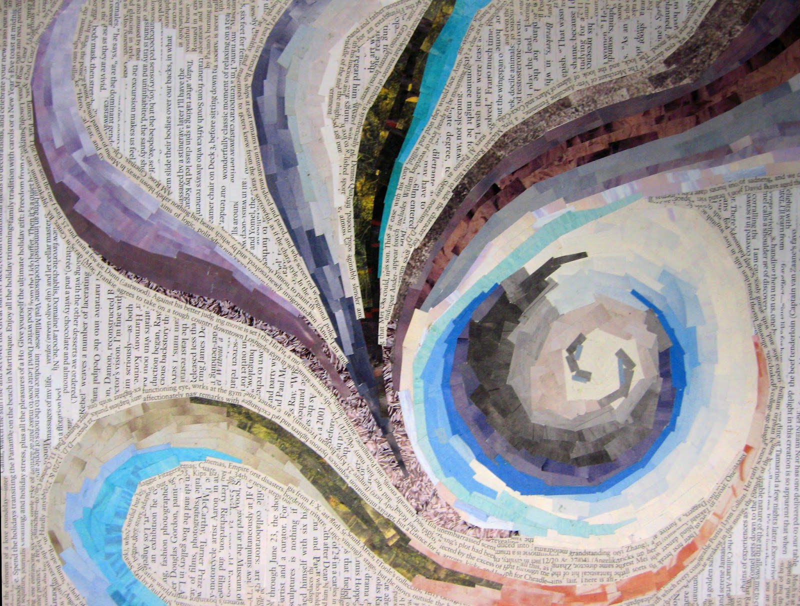
PROJECT 4 - Deconstructing the 4 Elements of Nature - Type/color/Image/compositions


You will create and depict 2 different typographic and image compositions interpreting two of the four classical elements—earth, air, fire and water.

Air is the element of intellect, study, and book learning. It is also the element of youth, creativity, and spontaneity, and of communication and travel.
Fire is the element of strength and energy. It is also the element of passion, courage, protection, purification, transformation, destruction, chaos, and sex. 
Water is the element of wisdom, clarity, and common sense. It is also the element of emotion, intuition and divination. 
Earth is the element of stability, order and grounding. It is the element of beginnings and endings.

Must be interpreted  in compositions, using harmonious color relations that create visual metaphors. Use your creative problem solving. 

Due Dates:
TUESDAY/THURSDAY CLASS:   Tuesday, February 18th 
MONDAY/WEDNESDAY CLASS:  Wednesday, February 19th 


Materials
• Bristol 9x12” format - 2 compositions
• glue - rubber cement, glue stick, elmer's glue
• scissors and xacto knives and rulers for straight edges
• tons of good magazine images with color and type!

Process
Cut imagery and type from magazines using conceptual thinking of how you would visually interpret the 2 elements you have selected. Again, DO NOT look at imagery and type in the literal sense. treat them as shapes, color, texture and reconstruct an original design. Combine interesting letters forms, sub-heads, paragraphs, etc... as you see fit. bold, medium light. USE HIERACHY OF SIZE, SMALL, MEDIUM, LARGE!  from different sources be aware of variety, flow, how images are seen as texture and how they both work together seamlessly. think layering, integration, thickness and shapes with images to design an appealing collage that conveys the element chosen. It's important to be sensitive to your color combinations, selections of textures and how they work as a whole aesthetically.

Do not use any representational imagery. you should look for color relations, texture, pattern tonal value of the colors. so you must look through the image and consider it for shape and color. Please remember to design your cut outs as well, this has great impact on the aesthetics of the final composition. Be thoughtful about the figure ground relationships, color combinations to create an effective and convincing final product.

Think about different ways to represent your element of choice. How do you see fire, air, water, earth? is it agitated, windy, passionate, arid... Is it tropical, desert, forest, is the water agitated, calm, is the air breezy, hurricane, tornado, etc... , what types of lines, shapes, color, composition, alignment... You need to use the scope of color values that exude the type of feeling you want to convey; you can combine type with images/shapes—but remember that these are typographic and image compositions.

Remember to also be very aware of designing your cuts and shapes. this has to be part of the process to achieve your desired results. Excellent craftsmanship. no sloppy edges or cuts! AESTHETICS ARE IMPORTANT!

Use combination of type as imagery as well as textural cut outs that communicate your goal. The result will be 2 (pick 2 out of 4) interesting and appealing compositions.


Nov 6, 2018

PROJECT 07 - COLOR RELATIONSHIP COMPOSITIONS USING COLOR WHEEL (COLOR THEORY)

DUE DATES: 
Wednesday/Thursday, November 7th / 8th 

Create a series of four dynamic compositions (4 of the same design). 9"x12" bristol paper. divide in 4 equal sections of 4 1/2"x6". Choose 4 different combinations of COLOR RELATIONSHIPS from color wheel for your compositions. Composition will remain the same on all 4 designs.  only colors will change in the each line drawing. 

Next: Select 4 color relationships from the 6 choices below (reference info below). Identify the color relationship and the original hues and write the information on the back of each composition with your name: 

Formal color relationships: 
analogous, monochromatic, triad
complimentary, split complimentary, double complimentary

Inspire yourself with images from nature, anything that has interesting details you can reference to build your concepts. You will be required to find a close up of image from nature or other non-represntational elements that has detailed areas of interest where you can see different design elements in the shapes of the image. This an abstraction/interpretive composition.

Use this as your blueprint to draw from. It can be inspired from your own creativity or from the shapes of images that exist in nature. Look at the details. explore, look beyond just the actual image of, i.e…  a flower, leaves, shattered glass, grid systems, water, etc... Deconstruct the shapes and details, make them work together, reconstruct, interpret the shapes and create your own design. Nature has many dynamic shapes that can inspire ideas. Interpret and recreate your own version.

You can use cropping L's or form a rectangle with your hands to focus in and search for select areas in the image. The cropping is to show how scaling up or down works in relation to the page size.

Use variations in size of shapes (small, medium, large), you should use a broad range of values using a little white to create contrast, use flat colors, solid colors. create focal areas, unity, flow, cohesive, Use your judgement on Aesthetics and provide creative visual solutions please. Be creative and inspired.

4 Color Relationship Studies will be chosen from the Color Wheel. 
ALL questions can be answered from these links below.
PLEASE READ AND RESEARCH!


Four repetitive compositions on 9”x 12” paper (split page in 4 equal quadrants) using the 4 different color relationships from the color wheel. Repeat same composition on each one. Using paints, execute your compositions using your chosen color relationships, use the pure saturated colors and their original tones and tints. use white to lighten or desaturate the colors (show values).

Select your main hue as starting point and from there, you will see relationships according to the color wheel. YOU must refer to the color wheel and the examples from the different combinations from the color wheel posted from the blog. Go back to the reference material on the color theory chapter of the blog. YOU MUST LEARN THE COLOR WHEEL AND ALL ITS RELATIONSHIPS.

Start anywhere on the color wheel, but you must respect the color relationships that are created from the main hue chosen. DO NOT deviate from the color selections. DO NOT use black. you can only use white to shift the values of hues. Where do the colors fall when using each relationship. you are to stick to them but can use pure color and incorporate tones and tints of that particular hue.

    - Complimentary colors
    - Split Complimentary colors
    - Double Complimentary colors
    - Analogous colors - Colors next to each other on the color wheel
    - Monochromatic colors
    - Triad

 Process / RECAP
•  Sketch out 4-6 different thumbnails for your desired composition. as many sketches needed to find
   the right solution for your painting. Experiment with pencil and play with color (color pencils or
   paint or watercolor) in your sketchbook so you can explore and figure out how the different
   relationships work together. Map out your sketch with light pencil drawing to insure placement
   of hues.
•  Write down your 4 final color relation selections and their proper hues.
•  Select the strongest composition to execute your final 9”x 12”  4 part painting.
•  Consult with teacher for final selection of strongest concepts.

Again you will be graded on understanding of how to use color wheel and and it's color relationships, creativity, aesthetics, craftsmanship, use of color variations, use of values, hierarchy of shapes in your design, harmony within the composition. Clean edges, solid, flat colors, no blending, clean edges, Clean brush strokes. Be clean and neat.

Materials
• White Bristol 9”x12” format (4 final repeating paintings)
• DO NOT USE BLACK. you can use white to create shift in value.

Check Georgia O’Keefe's work

Students Samples:

Focus on the individual compositions. look at repetition and the different color selections and how they are used. This is past work from prior 9th grade classes. Study them.


IMPORTANT: You will be responsible for an additional series of three 9"x12" during the holiday break. Both series of 3 designs will be presented for JURIES.