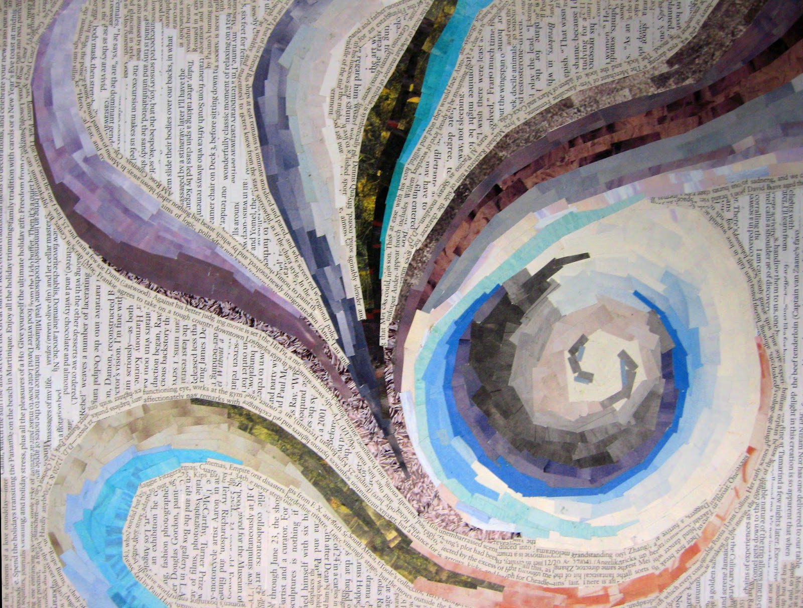
Showing posts with label ambiguous. Show all posts

Oct 6, 2020

REFERENCE - Figure/Ground Relationships

Figure/Ground Relationship

The figure/Ground relationship is the most basic of all relationships in design. It refers to the relationship between positive and negative shapes, and is used as an aid in 2-D composition. 

In art/design, one way we define space is by placing objects in it. This creates a relationship (object-in-space). Something and nothing. Placing an object IN space, defines that space, and CREATES a Figure/Ground Relationship. The object becomes the figure, and the space becomes the ground. 

Here is another way to think about it: The part of a composition that we pay attention to is called figure.  Everything that is not figure is ground. As attention shifts an object can go from figure to ground and back. Positive/Negative shape are analogous terms for Figure/Ground. 


Three Main Types of Figure/Ground Relationships

The figure and ground are inseparable. The figure always defines the ground, and the ground defines the figure. If you draw the figure in a composition, you are drawing the ground at the same time.

Stable-  Unchanging. You know what the figure is, and what the ground is. The focus of our attention does not change. 

Reversible- The positive and negative space/elements attract our attention equally. Our attention is drawn back and forth between the two. 

Ambiguous- The positive and negative space/elements challenge the viewer to find a focal point. What is the figure? What is the ground? Figure is entangled with ground without dominance. Ambiguous f/g relationships are usually abstract. See example below.

Rubin vase—an ambiguous figure/ground illusion. When you see the faces as figure, the vase is the ground. When you see the vase as figure, the faces are the ground.
The viewer shifts from one figure to the other but do not to see both as figure at the same time.


Compositional element within F/G relationships

Active- group elements off-center (asymmetrical) to create visual movement. 
Neutral- centered compositions are stable, not dynamic. Do not center! 
Bleeding- dynamic (it bleeds of the page, and can’t be contained)
Cropping- creates abstraction

Balance in F/G relationship 

In Stable relationship- balance (size/shape) = unified design.
In Reversible relationship-  balance (size/shape) = tension. which is which?
In Ambiguous relationship- balance (size/shape) = action. all space is active. 


Tips on working with figure/ground

  • Balancing figure and ground make the composition more clear.
  • Using unusual figure/ground relationships can add interest.
  • Spaces with convex (a), symmetric (b), smaller in area (c) or enclosed (d) shapes are “seen” as figure.
  • An expressive use of white space requires an asymmetrical design. Centering kills the white space (dividing it into unusable emptiness). Asymmetrical design creates a NEED for interestingly shaped white space. 
  • A deliberate use of white space creates + and - space that are equally important.

Sample Figure/Ground Relationship Studies


Feb 17, 2020

PROJECT 4 - Deconstructing the 4 Elements of Nature - Type/color/Image/compositions


You will create and depict 2 different typographic and image compositions interpreting two of the four classical elements—earth, air, fire and water.

Air is the element of intellect, study, and book learning. It is also the element of youth, creativity, and spontaneity, and of communication and travel.
Fire is the element of strength and energy. It is also the element of passion, courage, protection, purification, transformation, destruction, chaos, and sex. 
Water is the element of wisdom, clarity, and common sense. It is also the element of emotion, intuition and divination. 
Earth is the element of stability, order and grounding. It is the element of beginnings and endings.

Must be interpreted  in compositions, using harmonious color relations that create visual metaphors. Use your creative problem solving. 

Due Dates:
TUESDAY/THURSDAY CLASS:   Tuesday, February 18th 
MONDAY/WEDNESDAY CLASS:  Wednesday, February 19th 


Materials
• Bristol 9x12” format - 2 compositions
• glue - rubber cement, glue stick, elmer's glue
• scissors and xacto knives and rulers for straight edges
• tons of good magazine images with color and type!

Process
Cut imagery and type from magazines using conceptual thinking of how you would visually interpret the 2 elements you have selected. Again, DO NOT look at imagery and type in the literal sense. treat them as shapes, color, texture and reconstruct an original design. Combine interesting letters forms, sub-heads, paragraphs, etc... as you see fit. bold, medium light. USE HIERACHY OF SIZE, SMALL, MEDIUM, LARGE!  from different sources be aware of variety, flow, how images are seen as texture and how they both work together seamlessly. think layering, integration, thickness and shapes with images to design an appealing collage that conveys the element chosen. It's important to be sensitive to your color combinations, selections of textures and how they work as a whole aesthetically.

Do not use any representational imagery. you should look for color relations, texture, pattern tonal value of the colors. so you must look through the image and consider it for shape and color. Please remember to design your cut outs as well, this has great impact on the aesthetics of the final composition. Be thoughtful about the figure ground relationships, color combinations to create an effective and convincing final product.

Think about different ways to represent your element of choice. How do you see fire, air, water, earth? is it agitated, windy, passionate, arid... Is it tropical, desert, forest, is the water agitated, calm, is the air breezy, hurricane, tornado, etc... , what types of lines, shapes, color, composition, alignment... You need to use the scope of color values that exude the type of feeling you want to convey; you can combine type with images/shapes—but remember that these are typographic and image compositions.

Remember to also be very aware of designing your cuts and shapes. this has to be part of the process to achieve your desired results. Excellent craftsmanship. no sloppy edges or cuts! AESTHETICS ARE IMPORTANT!

Use combination of type as imagery as well as textural cut outs that communicate your goal. The result will be 2 (pick 2 out of 4) interesting and appealing compositions.


Feb 14, 2019

PROJECT 4 - Deconstructing the 4 Elements of Nature - Type/color/Image/compositions


You will create and depict 2 different typographic and image compositions interpreting two of the four classical elements—earth, air, fire and water.

Air is the element of intellect, study, and book learning. It is also the element of youth, creativity, and spontaneity, and of communication and travel.
Fire is the element of strength and energy. It is also the element of passion, courage, protection, purification, transformation, destruction, chaos, and sex. 
Water is the element of wisdom, clarity, and common sense. It is also the element of emotion, intuition and divination. 
Earth is the element of stability, order and grounding. It is the element of beginnings and endings.

Must be interpreted  in compositions, using harmonious color relations that create visual metaphors. Use your creative problem solving. 

Due Dates:
TUESDAY/THURSDAY CLASS:   Tuesday, February 19th 
MONDAY/WEDNESDAY CLASS:  Wednesday, February 20th 


Materials
• Bristol 9x12” format - 2 compositions
• glue - rubber cement, glue stick, elmer's glue
• scissors and xacto knives and rulers for straight edges
• tons of good magazine images with color and type!

Process
Cut image specimens and type from magazines using conceptual thinking of how you would visually interpret the 2 elements you have selected. Again, DO NOT look at imagery and type in the literal sense. treat them as shapes, color, texture and reconstruct an original design. Combine interesting letters forms, sub-heads, paragraphs, etc... as you see fit. bold, medium light. USE HIERACHY OF SIZE, SMALL, MEDIUM, LARGE!  from different sources be aware of variety, flow, how images are seen as texture and how they both work together seamlessly. think layering, integration, thickness and shapes with images to design an appealing collage that conveys the element chosen. It's important to be sensitive to your color combinations, selections of textures and how they work as a whole aesthetically.

Do not use any representational imagery. you should look for color relations, texture, pattern tonal value of the colors. so you must look through the image and consider it for shape and color. Please remember to design your cut outs as well, this has great impact on the aesthetics of the final composition. Be thoughtful about the figure ground relationships, color combinations to create an effective and convincing final product.

Think about different ways to represent your element of choice. How do you see fire, air, water earth? is it agitated, windy, passionate, arid... Is it tropical, desert, forest, is the water agitated, calm, is the air breezy, hurricane, tornado, etc... , what types of lines, shapes, color, composition, alignment... You need to use the scope of color values that exude the type of feeling you want to convey; you can combine type with images/shapes—but remember that these are typographic and image compositions.

Remember to also be very aware of designing your cuts and shapes. this has to be part of the process to achieve your desired results. Excellent craftsmanship. no sloppy edges or cuts!

Use combination of type as imagery as well as textural cut outs that communicate your goal. The result will be 2 (pick 2 out of 4) interesting and appealing compositions.


Oct 24, 2018

PROJECT 06: Figure/Ground Relationships (Space is Shape)

Project Due Date: Critique, Beginning of class

Section 1/Samimy: Monday, Oct. 29th
Section 2/Samimy: Tuesday, Oct. 30th

Project Description

You should have reviewed and understood the reference material on figure/ground relationships provided below.
Now, create a series of 3 abstract (non-representational) compositions using different cut out shapes in various sizes as necessary. Use the three types of figure/ground relationship to create a unique and effective composition. Use contrasting (variation in size) shapes against each other, layer shapes as you need, merge them together or place them stratigically keeping in mind the aesthetics of your composition. Crop, combine, repeat, mirror, rotate, enlarge, and/or reduce the shapes. Think about the following concepts listed below and the meaning of each relationship. Think creatively, aesthetically and be innovative:
  • Figure/ground relationship- stable/reversible/ambiguous
  • Balance- symmetrical/asymmetrica/all-over, equalized tension
  • Composition- dynamic/static
  • Vertical/diagonal/horizontal
  • Hierarchy (emphasis)
  • Movement/directionality

Process

    Homework
    Start doing thumbnails with pencil or black construction paper in your sketchbook, at least 3 different ideas for each composition (total 9 thumbnails on sketchbook.) If you haven't found a strong solution/idea… more thumbnail sketches will be necessary! 
      Class time-
      At start of class, consult with your teacher and select the best pieces. Choose 3 final designs that distribute positive and negative space into fluid, balanced compositions following the three required relationships. Note: You can explore enlarging the whole composition or some parts, cropping, adding or deleting shapes.
        Re-create the three selected compositions with black/colored, and white construction paper. Use the same type of paper for your 3 compositions, so you do not have any change in white/black/colored shapes.

        You will be graded on completion of thumbnail ideas, well resolved compositions, creativity, aesthetics, craftsmanship, neatness, class participation during critique. Deadlines must respected.

          Materials

          • black construction paper or colored paper of your choice
          • x-acto knife/sharp scissors
          • rubber cement or elmers type glue or glue stick
          • (3) 9" x 12" paper 

          Students Samples