Apr 24, 2018

Project 6: PROPORTIONAL/NON-PROPORTIONAL COLOR INVENTORY COMPOSITIONS - Due 4/30 and 5/1 & 5/7 & 5/8 2018

Your goal is to create a well balanced abstraction (non-representaitonal) composition based on the proportional color inventory of found colors you manage to isolate, mix and color match from the reference art you selected. Break away from the colors you like and start training the eye to assess color objectively. Find color combinations that you might not otherwise consider and get the ability to represent the countless tones of a visual source.

make a selection from more flat, solid, graphic artwork with a defined color amount that you can seperate and reproduce by mixing and matching that color palette.
you must consider the dominant areas and less dominant colors when you do your sketches. make a list of colors, measure out the color proportions on the 3"x 9" strip with ruler of course (straight lines) and figure out the larger areas, medium, smaller color areas. You will have to determine approximate visual percentages when breaking down the colors of your chosen piece of artwork. (10-15 chosen colors on your palette strip).

Design FOUR Sketches (showing color distribution and proportions) creating and mapping out a well balanced, creative abstract composition. Analyze and start applying colored areas in your sketches as a visual reference. use color pencils, watercolor etc on your drafts in your sketchbook. figure out the division of your color strip.

Materials
• Bristol board, 9x12"
• reference painting (from art books in closet)
• 9"x3" bristol strip for swatch of colors
• All 3 pieces to be (Reference Painting, color swatch palette, Final Composition)

Process
Find several pages from art magazines, art reproductions, Paintings with color combinations that you usually don't use. You are going to create a proportional color inventory, Meaning, taking a careful visual inventory of the colors used in the painting and mixing each color to match the original color and measure out on the swatch strip the dominant colors, less dominant and least dominant colors. Examine, analyze and map out the colors as well as thinking of your composition. you will create four sketches of ideas for composition. be very aware of the larger areas (break it up if you need) and smaller areas and you need use your imagination for color placement, separate them if you think it's to heavy in one area. again. check hierarchy, composition, color relations, ID the colors and where they will be placed for painting.

PROPORTIONAL INVENTORY
Make a proportional inventory with countable number of tones (select more graphic artwork or paintings where you can visually seperate different hues of the painting, or (textiles, woodcuts, or silkscreen prints are good sources.)

Create a color palette (about 9" X 3") that matches colors and estimates proportions. Design a composition of your own using the colors and proportions of the inventory.


Students' samples


Comp B NON-PROPORTIONAL INVENTORY
Make a non-proportional inventory with uncountable number of tones (images taken from the natural world are good sources).

This is different from Proportional inventory because the source images has so many colors and tones you must summerize the main colors that really create the essence of the piece of artwork you chose.

Begin the inventory with a square of flat color, (about 5 X 5 inches) use a background color directly from the image. Try to match the colors you observe precisely (the best you can), create between ten and 15 different dots. Design a composition of your own using tones drawn from the non-proportional inventory.


Students' samples


Apr 5, 2018

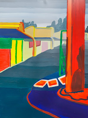
Project 5: Atmospheric Perspective. two compositions for In-Class for critique 4/11 and 4/12, 2018

Project Description

After having explored more systematic methods of muting color, you are now ready to work in a way that is more observational and interpretive as you explore nature's way of altering color. You will create a painting of a cityscape/landscape that gives the illusion of depth, using the concepts of both linear and atmospheric perspective. Your composition will be drawn from life. You may shoot photos to help create your composition and as reference to determine  value (light/shadow), perspective, using elements on different planes as focal areas in immediate foreground, midground, background. 

Don't rely on photos alone. be interpretive with your environment. you should move things around if necessary to achieve an ideal composition. you should also select a color pallette for your painting and also think of enhancing the hues to create a harmonious color scheme. the hues will usually shift from more saturated to muted and ultimately hues of chromatic grays leaning towards lighter and cooler blue grays as you reach the horizon lines.

The goal of this project is to apply what you have learned throughout this semester regarding color theory, the basic design components, composition, and painting technique to create a convincing landscape that shows illusion of depth.  

Schedule

Studio Day 1- In school. Create 4-5 sketches from life, sketch out different points of views creating environments with large depth-of-field and create illusion of depth as far as you can see... consider immediate foreground, middle ground, and background. 
Draw detailed sketches of different landscapes, and from different viewpoints. take notations for color pallettes. These will be graded.

for homework (monday/tuesday 4/9+4/10) 
Choose the best composition and redraw it on 9x12 bristol board. Be sure to address the following compositional concerns:
  1. What will my main focal point(s) be? How can I use line, shape and color to direct the viewer there?
  2. How is my eye moving around the page? Is the composition 'broken'- meaning, does your eye get stuck anywhere? If so, how can I fix the composition?
  3. Do the lines, shapes, and colors work together to create a sense of depth?
think of elements within your compositions that create markers for depth of field. don't leave empty, wide open spaces. fill the space with elements you find in your landscape to mark the different planes of depth and also create your color palette with swatches and start to paint. you can alter and exaggerate colors to give you more saturation in foreground, muted in middle ground and gradually move into chromatic grays for the background/vanishing area.

you may edit your images to improve your compositions moving elements around that makes sense in your drawing. This is ALSO interpretive. use the space wisely and not necessary to include so much detail. must give overall illusion of depth with different focal areas in each planes to help eye move around page.

Work on color schemes in your sketchbook. You must reference the color wheel when deciding on your colors. Have notes written in your sketchbook to answer the following questions:
  1. Which paints did you use to mix your colors? 
  2. What color schemes will you use, and where?(analogous in background, triad in middle ground, split compliment in foreground, etc) 
  3. How will you reduce the intensity/saturation and shift the value (lighter) and hue (cooler) as you move from foreground, through middle ground, to background?  
  4. How will you create more contrast in the foreground, and less in the background? consider shadows, highlights, midtowns. contrast is important.
Studio Day 2- Painting

You will have 2 hours to paint your composition. Be sure to have your sketchbook notes and composition with you. 
1:10pm- set up paints, etc. while I review the assignment. 
1:30pm- painting session
3:30pm- clean up
3:45pm- dismissal

Rubric

You will be assessed on both your process (time-management, being prepared, following all steps), and your finished project. 

Project will be graded according to: composition, your ability to create a sense of depth, craftsmanship/technique, and creativity. 

What is Atmospheric Perspective?

http://www.arthints.com/what-is-atmospheric-perspective/


Student Samples

These are all original scans of student work. they are digitally altered images and adjustments were made to show the improvements in creating atmospheric perspective. Improvements were made by increasing changes in contrast,  saturation, and value as you move from foreground to background. ie. most contrast, and saturation in the foreground. least contrast and saturation in the background. Value was also increased (made lighter) in the background. As you look further away... elements become faded out.