Showing posts with label contrast. Show all posts

Aug 18, 2022

REFERENCE - All about the LINE

 Line is a mark connecting two points; you can consider a line as a moving point.


Types of line

ACTUAL LINE—The line

IMPLIED LINE—An automatically connected series of unconnected points.

PSYCHIC LINE—The placement of the objects causes the viewer to look in a certain direction.


Categories to describe lines
TYPES OF LINE—the way it moves from beginning to end (straight, curves, angular)
LINE DIRECTION—relationship with the page (horizontal, vertical, diagonals)
LINE QUALITY—how the line is draw and the drawing media (delicate or bold, smooth or broken, thick or thin, regular or changing)
Uses of Line • To define shapes (contour drawing/cross-contour)
• To create texture (evoking our sense of touch)
• To create patterns (repetition)
• To create value (parallel lines “hatching” /intersecting lines “cross-hatching” create various density)
• To convey a mood (linear technique)
• To suggest motion (differences in line weight)

Working with lines • Stop/Start
• Change in directions
• Overlap or intersect
• Change in line weight (thick and thin)
• Closer together, farther apart


Mar 15, 2019

Project 5: Atmospheric Perspective. Two compositions for In-Class for critique 3/18 and 3/19, 2019

Project Description

After having explored more systematic methods of muting color, you are now ready to work in a way that is more observational and interpretive as you explore nature's way of altering color. You will create a painting of a cityscape/landscape that gives the illusion of depth, using the concepts of both linear and atmospheric perspective. Your composition will be drawn from life. You may shoot photos to help create your composition and as reference to determine  value (light/shadow), perspective, using elements on different planes as focal areas in immediate foreground, mid-ground, background. 

Don't rely on photos alone. be interpretive with your environment. you should move things around if necessary to achieve an ideal composition. you should also select a color pallette for your painting and also think of enhancing the hues to create a harmonious color scheme. the hues will usually shift from more saturated to muted and ultimately hues of chromatic grays leaning towards lighter and cooler blue grays as you reach the horizon lines.

The goal of this project is to apply what you have learned throughout this semester regarding color theory, the basic design components, composition, and painting technique to create a convincing landscape that shows illusion of depth.  

Studio Day 1- In school. Create 4-5 sketches from life, sketch different points of views creating environments with large depth-of-field, creating an illusion of depth as far as you can see... consider immediate foreground, middle ground, and background.These will be graded.


for homework

Choose the best composition and redraw it on 9x12 bristol board. Be sure to address the following compositional concerns:
  1. What will my main focal point(s) be? How can I use line, shape and color to direct the viewer there?
  2. How is my eye moving around the page? Is the composition 'broken'- meaning, does your eye get stuck anywhere? If so, how can I fix the composition?
  3. Do the lines, shapes, and colors work together to create a sense of depth?
think of elements within your compositions that create markers for depth of field. don't leave empty, wide open spaces. fill the space with elements you find in your landscape to mark the different planes of depth and also create your color palette with swatches and start to paint. you can alter and exaggerate colors to give you more saturation in foreground, muted in middle ground and gradually move into chromatic grays for the background/vanishing area.

you may edit your images to improve your compositions moving elements around that makes sense in your drawing. This is ALSO interpretive. use the space wisely and not necessary to include so much detail. must give overall illusion of depth with different focal areas in each planes to help eye move around page.

Work on color schemes in your sketchbook. You must reference the color wheel when deciding on your colors. Have notes written in your sketchbook to answer the following questions:
  1. Which paints did you use to mix your colors? 
  2. What color schemes will you use, and where?(analogous in background, triad in middle ground, split compliment in foreground, etc) 
  3. How will you reduce the intensity/saturation and shift the value (lighter) and hue (cooler) as you move from foreground, through middle ground, to background? 
  4. How will you create more contrast in the foreground, and less in the background? consider shadows, highlights, midtowns. contrast is important.
Studio Day 2- Painting
You will have 2 hours to paint your composition. Be sure to have your sketchbook notes and composition with you. 
1:10pm- set up paints, etc. while I review the assignment. 
1:30pm- painting session
3:30pm- clean up
3:45pm- dismissal

Rubric
You will be assessed on both your process (time-management, being prepared, following all steps), and your finished project. Project will be graded according to: composition, your ability to create a sense of depth, craftsmanship/technique, and creativity. 

What is Atmospheric Perspective?

http://www.arthints.com/what-is-atmospheric-perspective/


Student Samples
These are original scans of student work. they are digitally altered images and adjustments were made to show the improvements in creating atmospheric perspective. Improvements were made by increasing changes in contrast,  saturation, and value as you move from foreground to background. ie. most contrast, and saturation in the foreground. least contrast and saturation in the background. Value was also increased (made lighter) in the background. As you look further away... elements become faded out.


Oct 24, 2018

PROJECT 06: Figure/Ground Relationships (Space is Shape)

Project Due Date: Critique, Beginning of class

Section 1/Samimy: Monday, Oct. 29th
Section 2/Samimy: Tuesday, Oct. 30th

Project Description

You should have reviewed and understood the reference material on figure/ground relationships provided below.
Now, create a series of 3 abstract (non-representational) compositions using different cut out shapes in various sizes as necessary. Use the three types of figure/ground relationship to create a unique and effective composition. Use contrasting (variation in size) shapes against each other, layer shapes as you need, merge them together or place them stratigically keeping in mind the aesthetics of your composition. Crop, combine, repeat, mirror, rotate, enlarge, and/or reduce the shapes. Think about the following concepts listed below and the meaning of each relationship. Think creatively, aesthetically and be innovative:
  • Figure/ground relationship- stable/reversible/ambiguous
  • Balance- symmetrical/asymmetrica/all-over, equalized tension
  • Composition- dynamic/static
  • Vertical/diagonal/horizontal
  • Hierarchy (emphasis)
  • Movement/directionality

Process

    Homework
    Start doing thumbnails with pencil or black construction paper in your sketchbook, at least 3 different ideas for each composition (total 9 thumbnails on sketchbook.) If you haven't found a strong solution/idea… more thumbnail sketches will be necessary! 
      Class time-
      At start of class, consult with your teacher and select the best pieces. Choose 3 final designs that distribute positive and negative space into fluid, balanced compositions following the three required relationships. Note: You can explore enlarging the whole composition or some parts, cropping, adding or deleting shapes.
        Re-create the three selected compositions with black/colored, and white construction paper. Use the same type of paper for your 3 compositions, so you do not have any change in white/black/colored shapes.

        You will be graded on completion of thumbnail ideas, well resolved compositions, creativity, aesthetics, craftsmanship, neatness, class participation during critique. Deadlines must respected.

          Materials

          • black construction paper or colored paper of your choice
          • x-acto knife/sharp scissors
          • rubber cement or elmers type glue or glue stick
          • (3) 9" x 12" paper 

          Students Samples


          Sep 12, 2018

          PROJECT 03: TWO PART Assignment - 10 GRAYSCALE VALUE STUDIES / COMPOSITION Applying gray value scales

          Due Dates (Week of September 11 contingent on weather conditions)
          Section 1/Samimy, Due Date: Thursday, Sept. 13
          Section 2/Samimy: Due Date: Monday, Sept. 17

          MUST WORK ON VALUE SCALES AND 6-8 THUMBNAIL STUDIES OF ORIGINAL DESIGN OVER THE CLOSING OF SCHOOL DUE TO IMPENDING WEATHER CONDITIONS.

          Project Description

          End goal of Project: You will Create 2 non-representational (abstract) compositions that show a wide rage of gray values using only pencil. You cannot use gradients within each shape. They must be continuous values of gray. You may also apply textural patterns and stippling that will also show value and contrast. (See reference below). You can inspire your designs from different elements of nature, or any other inspirational imagery. Must be interpretive or original designs.

          Apply more pressure to obtain darker grays and less pressure for lighter gray values. pay attention to detail and craft. Remember no smudging to get the gray.

          Materials Needed

          • Graphite pencils - Range from hard leads - soft leads  (2H, HB, 2B, 4B,6B,)
          • 9"x12" size paper (divide in 2 equal sections measuring 6"x9")

          Demonstration links for developing 10 value graysale black-white:

          https://www.youtube.com/watch?v=0QD0CUfL_pQ

          https://www.youtube.com/watch?v=IzzRZE0LTPk

          Process/Schedule

          Day one (In-Class)
          A. Presentation 
          Short lecture going over the concept of value, shading techniques, and overview of compositional strategies. 

          B. Value Scales
          Practice your value scales in your sketchbooks. Each value scale should consist of ten levels ranging from black to white. Start by making a grid, 1/4" - 1/2" square, then shade each square individually. Be sure to keep the value consistent within each square, and keep the change in value consistent from square to square. Each square must show distinctive values. Fill at least one sketchbook page of scales studies.

          10 Step Value Scale


          C. Compositional  Sketches 
          Once you adapt to using your pencil and it's various pressures, start doing approximately 3" x 5" thumbnails in your sketchbook- at least 6-8 thumbnail sketches developing ideas for the 2 compositions (total 6-8 thumbnails in sketchbook). You will be graded on this. AREAS SHOULD WORK IN SOME WHITE SPACE AND TEXTURAL MARKINGS. Sketches and design ideas will be due at the beginning of the next class.

          D. Homework
          Finish a full page of value scales, and at least 6 3" x 5" compositional sketches to be turned in at the beginning of class for review. Along with the full page of value scales, your DETAILED thumbnails will be graded for 50% of your total grade. DUE AT BEGINNING OF CLASS

          Final Compositions (DUE AT END OF CLASS) Consult with your teacher via text or "remind" and also speak with your fellow students, to select the best two compositions for your final designs. These will be completed on the measured6"x9" bristol board divided in half on page. Remember to try and communicate two distinct ideas (this can be an emotion, nature, imagined design or anything else you can think of)

          Rubric

          Assessment is based on your creativity, composition, craftsmanship, time-management, and the completion of all steps of the process (8 preliminary sketches, 5 value scales, 2 finished compositions). Your final pieces must contain 10 steps in value from black to white. 


          Students Samples


          May 9, 2018

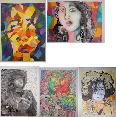
          MIXED MEDIA ASSEMBLAGE/COLLAGE PROJECT – DUE DATE- 5/15 + 5/16, 2018

          Purpose
          Create two mixed-media portraits or still life on Bristol board or other surface. Think about the theme of your persona or your subject's persona and style on how you will approach the project. This is not about traditional portraiture or just creating a typical still life, it's an interpretation as well, it's your original, unique vision, but it gives you the freedom to find creative solutions to challenge traditional perceptions. Think abstract, deconstruction, mixed media, collaging, material, overlapping, LAYERING and weaving in your elements in creating a strong compositional solution. use your creative mind and create an affective integrated, cohesive series of TWO works of art that challenge the norm. Intergrate! don't treat your materials as seperates. they all must work together. INTEGRATION, NOT SEPARATION.

          Two interpretive pieces either alternative portraiture or still life. Through the process, you will begin to explore additive technique in two-dimensional art. In particular, you will experiment with integrating collaging with traditional painting and drawing techniques. MUST BE VISUALLY PLEASING (good aesthetics please). Think and analyze your process, method of execution and explore creative solutions. Be experimental.

          Attention will be given to the design principles we covered first semester. Namely: (framing, Scale, Hierarchy (points of interest/focal areas/emphasis), asymmetry, cropping techniques,  Textural look or feel, F/G relationship, balance, composition, value, contrast and color theory/relationships), color palette, asymmetry. All that we have studied thus far is crucial in creating a cohesive unified solution. How will everything tie in together to create a balanced composition. 

          This project is treated as an abstraction and interpretive. not to be literal. All elements must work together to create a cohesive (unified), resolved, and finished work. Really think about your approach as in theme, style, be selective with materials and how to work them into your composition. Integrate the materials thinking of overlapping, layering, creating transparency in your finished piece. That can be done with different methods of layering mediums. You really need to analyze your piece and be visually aware of your AESTHETICS.

          Due Dates (Critiques)
          Mon/Wed Class: Wednesday, May 16th. 
          Tues/Thurs Class: Tuesday, May 15th. 

          Rubric
          You will be assessed on your application of the design principles mentioned above, your creative solution, integration of materials, craftsmanship, composition, execution, sketches, and your creativity. 
          Note: All projects turned in after the due-date will be reduced by one letter grade. 

          Materials

          • Two Sheets of Bristol board or  other surfaces 9" x 12" 
          • Paint, markers, colored pencils, charcoal, watercolors, etc.
          • Fabric scraps, tissue paper, magazine cutouts, string, yarn, newspaper, etc.
          • Appropriate adhesive (white glue, rubber cement, gel medium, sewing kit)

          Process

          Step 1
          In your sketchbook, create 3 different contours (silhouettes) or whatever subject matter you choose that you will use as a reference for your collage. Themes can be a deconstructed portraiture, figurative, still life, abstract environment. BUT ALL ELEMENTS OF MEDIUMS AND MATERIALS MUST BE INTEGRATEAD, WEAVED INTO EACHOTHER, OVERLAPPING, INTERSECTING. MAKE IT A UNIFIED COMPOSITION. NOT COMPARMENTALISED. ELEMENTS MUST BE INTERGRATED NOT SEPERATED. MUST ALL WORK AS A WHOLE! THE SOME OF ALL PARTS. TOGETHER. FLOW, UNITY, COHESIVE. MUST WORK AS A PAIR.

          PLEASE STUDY THE LINKS AND ARTIST LISTED. GIVES YOU IDEAS AND RESEARCH MATERIALS. POINTS OF REFERENCE. PLEASE!!!!

          Begin by mapping out a theme/concept, think about materials, color palette, MAIN MATERIALS, your layout for both pieces, their relationships. what will crossover be? what is the common ground of your visuals, etc... Pay close attention to details, such as facial features or objects for still life. framing is important! and their relative size and position to one another. Be sure to map all these elements out correctly. Use cropping, scale and position on paper to create a dynamic composition.

          Draw a silhouette of the head, then include neck and shoulders, add hair, include ears... Think about what you could add/remove to make it unique (pencil behind ear, sunglasses in hair, specific earring, etc). of course this also applies to a still life and all of its accents. whats the environment? look at Braque and Picasso JOSEPH CORNELL ASSEMBLAGES/collages. 

          Process to consider when creating your mixed media composition. Think abstract. Think creative. deconstruct. think of creating focal areas and how your eye travels through the piece. WHAT ARE THE FOCAL AREAS? MAIN SUBJECT, SECONDARY TERTIARY FOCAL AREAS. Must have emphasis. things can't have equal importance on your canvas. there will always be a main subject. can't have everything same size, same value, same anyting. have to keep it DYNAMIC!

          Step 2
          Focus on other areas of your body as an option- hands, feet, legs, and entire figure. Repeat the steps above, to create 5 more contours from these observational drawings. 

          Step 3
          Tape the composition to a wall, take a step back, and examine all contours area of composition and theme. Examine the positive/negative space, and composition, of each contour. What is successful. SQUINT.

          Now, look at the compositions alongside each other. Pay attention to the different ways the compositions interact with each other. How do they inform (relate and influence) each other? What combinations of compositions are particularly successful? WHAT IS THE FOCAL AREAS? MAIN SUBJECT, SECONDARY TERTIARY FOCAL AREAS. 

          Step 4
          Based on the observations in Step 3, choose one (or more) compositions to use as a starting point. Find ways to make the composition stronger, by overlapping, intersecting, combining, cutting, cropping, sewing stitching, glueing, etc.  Continue to refine the composition by rearranging, adding, and deleting elements.

          Step 5
          Explore with different materials (paint, collage, markers, fabric, metal, etc), continuing to refine the composition. Use color, texture, and value to tie everything together. 

          NOTE: THIS IS NOT A 3-D PROJECT; KEEP THE WORK 2-D.It can have lots of texture,  alittle relief 1/8" and some depth, but the base board must be able to physically support all the materials you have incorporated. 

          Research the words: Assemblage, Mixed-Media, Collage. below are other references.

          Art-Historical Examples


          Students Samples