Showing posts with label craftsmanship. Show all posts

Feb 14, 2018

PROJECT 4 - Deconstructing the 4 Elements of Nature - Type/color/Image/compostion


You will create and depict 2 different typographic and image compositions interpreting two of the four classical elements—earth, air, fire and water.

Air is the element of intellect, study, and book learning. It is also the element of youth, creativity, and spontaneity, and of communication and travel.
Fire is the element of strength and energy. It is also the element of passion, courage, protection, purification, transformation, destruction, chaos, and sex. 
Water is the element of wisdom, clarity, and common sense. It is also the element of emotion, intuition and divination. 
Earth is the element of stability, order and grounding. It is the element of beginnings and endings.
Or for the above 4... however you interpret this in strong compositions, using harmonious color relations that create visual metaphors. Use your creative problem solving. 

Due Dates (2 Critiques in one week)
MONDAY/WEDNESDAY CLASS: February 19th and 21st
TUESDAY/THURSDAY CLASS:   February 20th and 22nd

Materials
• Bristol 9x12” format - 2 compositions
• glue - rubber cement, glue stick, elmer's glue
• scissors and xacto knives and rulers for straight edges
• tons of good magazine images with color and type!

Process
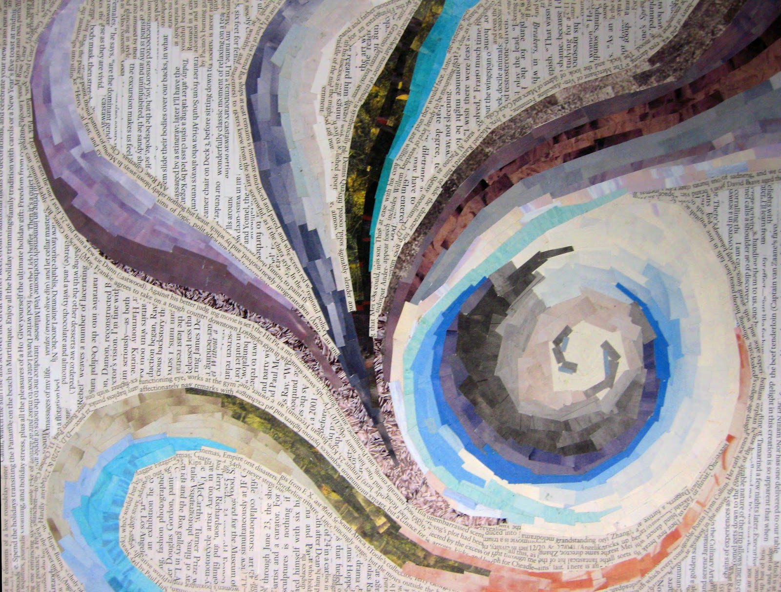
Cut image specimens and type from magazines using conceptual thinking of how you would visually interpret the two elements you have selected. Again, DO NOT look at imagery and type in the literal sense. treat them as shapes, color, texture and reconstruct an original design. Combine interesting letters forms, sub-heads, paragraphes, etc... as you see fit. bold, medium light from different sources be aware of variety, flow, how images are seen as texture and how they both work together seamlessly. think layering, integration, thickness and shapes with images to design an appealing collage that conveys the element chosen. It's important to be sensitive to your color combinations, selections of textures and how they work as a whole aesthetically.

Do not use any representational imagery. you should look for color relations, texture, pattern tonal value of the colors. so you must look through the image and consider it for shape and color. Please remember to design your cut outs as well, this has great impact on the aesthetics of the final composition. Be thoughtful about the figure ground relationships, color combinations to create an effective and convincing final product.

Think about different ways to represent your element of choice. How do you see fire, air, water earth? is it agitated, windy, passionate, arid... Is it tropical, desert, forest, is the water agitated, calm, is the air breezy, hurricane, tornado, etc... , what types of lines, shapes, color, composition, alignment... You need to use the scope of color values that exude the type of feeling you want to convey; you can combine type with images/shapes—but remember that these are typographic and image compositions.

Remember to also be very aware of designing your cuts and shapes. this has to be part of the process to achieve your desired results. Excellent craftsmanship. no sloppy edges or cuts!

Use combination of type as imagery as well as textural cut outs that communicate your goal. The result will be 2 (pick 2 out of 4) interesting and appealing compositions.


Oct 1, 2017

PROJECT 04 - VALUE COMPOSITION IN GRAYSCALE


From a total of 72 grayscale swatches, which are 3 carefully measured gridded sheets, you will create a value scale representing TEN EVEN steps from black to white (black and white with eight even incremental changes in-between).

Your completed swatches will be carefully selected and will be mounted on a 2"x11" paper strip to insure all swatches are successfully mounted in a gray scale with even value shifts for critique. End product will be a well crafted value scale of 10 even values from black –white.


Watch and  Demonstration video:

Materials
-Mars Black and Titanium White acrylic use same manufacturers throughout process)
-9x12 inch bristol board x 3
-Pallet knife
-2 - 3/4" - 1" Brush (bright)
-2 cups (for water)
-Paint palette (wax pallet paper)
-Paper Towels
Process/Schedule


During Class Period
  1. Lay out grid (to create your swatches) on bristol board. 3 sheets total if you succeed to create a wide range of well painted solid values. 
  2. Grid will have a total of 24 rectangular swatches per page, each measuring 1"x2" with 1/2" space in-between each rectangle. 3 swatches across top of 9"x12" page and 8 swatches down the length of page. Total swatches per page = 24
  3. Neatly Lay separately reasonable amount of black and white paints out on palette. Mix paints starting from black (or white) and adding incremental amounts of the opposite color. Start with a clean pure white and pure black and also mix a mid tone gray that you can mix with white for lighter and black for darker values. Mix paint throughly with palette knife and then brush until well mixed and you have a solid tone and brush-in swatches to fill the entire page. Must paint with smooth strokes, no streaks and an opaque thick coat of paint for full coverage. will have to use 2-3 of coats of paint to achieve a smooth clean opaque gray tone. 
  4. When mixing lighter colors please note you must mix a minimal amount of black to white. Black is a very strong dominant pigment so be very careful how much you mix into the white. it will dominate instantly.
  5. Each swatch should have consistent gray shift, and be a unique value. You Must paint 3-4 of same values until you achieve smooth/even result.The more variety of values you paint, the easier it will be to select 10 strong swatches to create the final value scale.
  6. The goal is to create as many distinct values as you can. Fill in each rectangle of your grid with a solid value. Paint slightly beyond the borders. you must still be able to see original guides as you will be carefully cutting out each swatch one by one with an exact blade.
  7. Be sure you have all 10 values represented from from black (straight from the tube) progressing to middle gray, and continuing through light grays toward bright white (also straight from the tube). 
  8. Clean your workspace and all your painting materials (brushes, palettes, etc)

During Class Period
  1. Finish painting your 3 pages of value swatches. 3 pages minimum.
  2. Lay out your presentation board, using the guidelines provided below.
  3. With a metal ruler, and cutting board, carefully cut-out your painted swatches like strips on the 2" sides, but leaving the edges still intact so you do not lose track of your pencil markings, as they will be your guides to achieving precsion in your final cuts. Do not cut the strips they must be anchored on the on the 2" length first. do not cut the shorter 1" side yet. that will be cut slightly beyond the 2" margin. Cut very carefully following the guides you measured out. Makes life easier and cuts will be much more exact. Make sure cuts are clean, by using a new x-acto blade. NO CUTTING DIRECTLY ON TABLES. Cutting boards must be used. These have to be as close to perfect as possible.

Homework

  1. Finish laying out your black presentation board, using the guidelines provided. 
  2. Bring your presentation board to class, along with your x-acto knife. 
  3. Finish cutting out your swatches, if not finished in class.
  4. You may first glue your swatches on a strip of 2"x11" as a safety net to make sure all swatches are glued right next to each other and follow a straight pattern vertically.


Final Class Period
  1. Select the best swatches from your entire page that represent 10 consistent steps in value. 
  2. Show your presentation board (with layout lines/grid) to instructor. Once it has been given the ok, proceed with mounting of swatches. DO NOT PROCEED UNTIL YOUR LAYOUT HAS BEEN APPROVED.
  3. Using rubber cement, carefully glue swatches to presentation board. There should be no gaps between swatches, and all swatches should be perfectly aligned. 
  4. Let rubber cement dry slightly, and remove any excess glue with the appropriate eraser. 
  5. Neatly Label (name and date) your work with hard pencil in lower right-hand corner. 
  6. Cut and tape tissue paper sheet to act as protector. 
The final 30 mins of class will be reserved for critique.

Rubric (Assignment Goals)

You will be evaluated on the following:

1. Laying out your bristol board into an even grid (even measurements, straight lines).
2. Your ability to mix the paints evenly. 
3.  Painting swatches that are free of brush strokes, or excessive paint build up.
4.  Filling up your entire page with different/distinct values.
5. Choosing the best 10 swatches that represent even steps from black to white. 
6. Laying out your presentation board neatly (consistent measurements, and centered)
7. Cutting out your swatches, and mounting them to the presentation board. 
8. Removing excess glue and having all your swatches line up evenly. 

Layout Measurements

Below is the sample of the GRID for the Value scales. you need to me sure and cut the 2"x11" support strip to glue your swatches. if you have questions please communicate with your class mates during the break.


Sep 29, 2015

PROJECT 04 - VALUE COMPOSITION IN GRAYSCALE

Due Dates
Section 1/Samimy: Monday, October 5th
Section 2/Samimy: Tuesday, October 6th

Project Description

Create 2 non-representational (abstract) compositions that show a wide rage of gray values using only pencil. You cannot use gradients within each shape. They must be continuous values of gray.
Apply more pressure to obtain darker grays and less pressure for lighter gray values. pay attention to detail and craft. Remember no smudging to get the gray.

Materials

• pencil (2H, HB, 2B, 4B,6B)


Process/Schedule

Day one (In-Class)
A. Presentation 
Short lecture going over the concept of value, shading techniques, and overview of compositional strategies. 

B. Value Scales
Practice your value scales in your sketchbooks. Each value scale should consist of ten levels ranging from black to white. Start by making a grid, then shade each square individually. Be sure to keep the value consistent within each square, and keep the change in value consistent from square to square. 

10 Step Value Scale


C. Compositional  Sketches 
Once you adapt to using your pencil and it's various pressures, start doing 2" x 3" thumbnails in your sketchbook- at least 4 for each composition (total 8 thumbnails on sketchbook. You will be graded on this. NO AREAS SHOULD BE LEFT BLANK. These are due at the beginning of the next class.

D. Homework

Finish a full page of value scales, and eight 2" x 3" compositional sketches to be turned in at the beginning of class. Along with the full page of value scales, your DETAILED thumbnails will be graded for 50% of your total grade. DUE AT BEGINNING OF CLASS

Final Compositions (DUE AT END OF CLASS) Consult with your teacher via email, and also speak with your fellow students, to select the best two compositions for your final designs. These will be completed on the 6"x9" bristol board. Remember to try and communicate two distinct ideas (this can be an emotion, or anything else you can think of)

Rubric

Assessment is based on your creativity, composition, craftsmanship, time-management, and the completion of all steps of the process (8 preliminary sketches, 5 value scales, 2 finished compositions). Your final pieces must contain 10 steps in value from black to white. 


Students Samples
 
 
More Samples