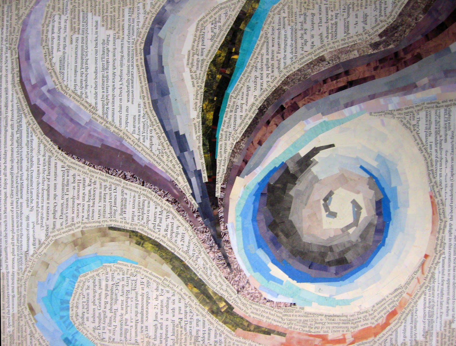
You will create and depict 2 different typographic and image compositions interpreting two of the four classical elements—earth, air, fire and water.
Air is the element of intellect, study, and book learning. It is also the element of youth, creativity, and spontaneity, and of communication and travel.
Fire is the element of strength and energy. It is also the element of passion, courage, protection, purification, transformation, destruction, chaos, and sex.
Water is the element of wisdom, clarity, and common sense. It is also the element of emotion, intuition and divination.
Earth is the element of stability, order and grounding. It is the element of beginnings and endings.
Or for the above 4... however you interpret this in strong compositions, using harmonious color relations that create visual metaphors. Use your creative problem solving.
Due Dates (2 Critiques in one week)
MONDAY/WEDNESDAY CLASS: February 19th and 21st
TUESDAY/THURSDAY CLASS: February 20th and 22nd
• Bristol 9x12” format - 2 compositions
• glue - rubber cement, glue stick, elmer's glue
• scissors and xacto knives and rulers for straight edges
• tons of good magazine images with color and type!
Process
Cut image specimens and type from magazines using conceptual thinking of how you would visually interpret the two elements you have selected. Again, DO NOT look at imagery and type in the literal sense. treat them as shapes, color, texture and reconstruct an original design. Combine interesting letters forms, sub-heads, paragraphes, etc... as you see fit. bold, medium light from different sources be aware of variety, flow, how images are seen as texture and how they both work together seamlessly. think layering, integration, thickness and shapes with images to design an appealing collage that conveys the element chosen. It's important to be sensitive to your color combinations, selections of textures and how they work as a whole aesthetically.
Do not use any representational imagery. you should look for color relations, texture, pattern tonal value of the colors. so you must look through the image and consider it for shape and color. Please remember to design your cut outs as well, this has great impact on the aesthetics of the final composition. Be thoughtful about the figure ground relationships, color combinations to create an effective and convincing final product.
Think about different ways to represent your element of choice. How do you see fire, air, water earth? is it agitated, windy, passionate, arid... Is it tropical, desert, forest, is the water agitated, calm, is the air breezy, hurricane, tornado, etc... , what types of lines, shapes, color, composition, alignment... You need to use the scope of color values that exude the type of feeling you want to convey; you can combine type with images/shapes—but remember that these are typographic and image compositions.
Remember to also be very aware of designing your cuts and shapes. this has to be part of the process to achieve your desired results. Excellent craftsmanship. no sloppy edges or cuts!
Use combination of type as imagery as well as textural cut outs that communicate your goal. The result will be 2 (pick 2 out of 4) interesting and appealing compositions.