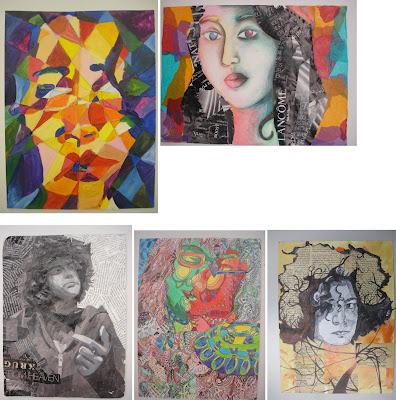
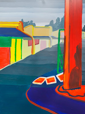
Purpose
You will work on a 2 mixed media projects over two week period.
1- Create either two mixed-media portraits or still lives on alternative surfaces or paper
or in sketchbook if you do not have paper to work with. use thick paper or cardboard
if necessary.
2- Create a 12 page ZINE (can be different size from 3x3 or 4x4 or 5x7) folded paper and
stapled or sewn or any other method of putting pages together. if you don't have any paper at all you can work in your sketchbook. but I am sure you can discover found paper and alternative materials in your home. It's easy if you hunt for good surfaces to work from. it could be copy paper and you can double up with other paper to make stronger. light cardboard, corrugated surfaces, old books, any form of magazines, magazine covers, books etc... you can use it as textured backgrounds to paint on as well. remember this is a layering project so you can really be creative!
you can even write poetry, stream of consciousness, thoughts and weave them into your artwork.
Think about theme (personal, social, political, interests, corona virus, feelings, emotions) choose something that interests you for your story and how you will execute your zine in your sketchbook 6 pages or create your ZINE out of sheets of folded found paper.
think about your materials and the whole mixed media concept of using different things like tape, sewing stitching. how you will intergrate materials. magazine cutouts, different papers, textures, layering materials.
for portraits, Think about the theme of your subject's persona and style on how you will approach the project. This is not about traditional portraiture or just creating a typical still life, it's an interpretation as well, it's your original, unique vision, but it gives you the freedom to find creative solutions to challenge traditional perceptions.
this applies to both options:
Think abstract, deconstruction, mixed media, collaging, material, overlapping, LAYERING and weaving in your elements in creating a strong compositional solution. use your creative mind and create an affective integrated, cohesive series of TWO works of art that challenge the norm. Intergrate! don't treat your materials as seperates. they all must work together. INTEGRATION, NOT SEPARATION.
Two interpretive pieces either alternative portraiture or still life. Through the process, you will begin to explore additive technique in two-dimensional art. In particular, you will experiment with integrating collaging with traditional painting and drawing techniques. MUST BE VISUALLY PLEASING (good aesthetics please). Think and analyze your process, method of execution and explore creative solutions. Be experimental.
Attention will be given to the design principles we covered first semester. Namely: (framing, Scale, Hierarchy (points of interest/focal areas/emphasis), asymmetry, cropping techniques, Textural look or feel, F/G relationship, balance, composition, value, contrast and color theory/relationships), color palette, asymmetry. All that we have studied thus far is crucial in creating a cohesive unified solution. How will everything tie in together to create a balanced composition.
This project is treated as an abstraction and interpretive. not to be literal. All elements must work together to create a cohesive (unified), resolved, and finished work. Really think about your approach as in theme, style, be selective with materials and how to work them into your composition. Integrate the materials thinking of overlapping, layering, creating transparency in your finished piece. That can be done with different methods of layering mediums. You really need to analyze your piece and be visually aware of your AESTHETICS.
This project is treated as an abstraction and interpretive. not to be literal. All elements must work together to create a cohesive (unified), resolved, and finished work. Really think about your approach as in theme, style, be selective with materials and how to work them into your composition. Integrate the materials thinking of overlapping, layering, creating transparency in your finished piece. That can be done with different methods of layering mediums. You really need to analyze your piece and be visually aware of your AESTHETICS.
Due Dates (Critiques)
Mon/Wed Class: Monday, 4/6 .
Tues/Thurs Class: Tuesday, 4/7. Rubric
You will be assessed on your application of the design principles mentioned above, your creative solution, integration of materials, craftsmanship, composition, execution, sketches, and your creativity.
Note: All projects turned in after the due-date will be reduced by one letter grade.
Materials
- Two Sheets of Bristol board or other surfaces 9" x 12"
- Paint, markers, colored pencils, charcoal, watercolors, etc.
- Fabric scraps, tissue paper, magazine cutouts, string, yarn, newspaper, etc.
- Appropriate adhesive (white glue, rubber cement, gel medium, sewing kit)
Process
Step 1
In your sketchbook, some ideas or whatever subject matter you choose that you will use as a reference for your collage. Themes can be a deconstructed portraiture, figurative, still life, abstract environment. BUT ALL ELEMENTS OF MEDIUMS AND MATERIALS MUST BE INTEGRATEAD, WEAVED INTO EACHOTHER, OVERLAPPING, INTERSECTING. MAKE IT A UNIFIED COMPOSITION. NOT COMPARMENTALISED. ELEMENTS MUST BE INTERGRATED NOT SEPERATED. MUST ALL WORK AS A WHOLE! THE SOME OF ALL PARTS. TOGETHER. FLOW, UNITY, COHESIVE. MUST WORK AS A PAIR.
PLEASE STUDY THE LINKS AND ARTIST LISTED. GIVES YOU IDEAS AND RESEARCH MATERIALS. POINTS OF REFERENCE. PLEASE!!!!
PLEASE STUDY THE LINKS AND ARTIST LISTED. GIVES YOU IDEAS AND RESEARCH MATERIALS. POINTS OF REFERENCE. PLEASE!!!!
Begin by mapping out a theme/concept, think about materials, color palette, MAIN MATERIALS, your layout for both pieces, their relationships. what will crossover be? what is the common ground of your visuals, etc... Pay close attention to details, such as facial features or objects for still life. framing is important! and their relative size and position to one another. Be sure to map all these elements out correctly. Use cropping, scale and position on paper to create a dynamic composition.
Draw a silhouette of the head, then include neck and shoulders, add hair, include ears... Think about what you could add/remove to make it unique (pencil behind ear, sunglasses in hair, specific earring, etc). of course this also applies to a still life and all of its accents. whats the environment? look at Braque and Picasso JOSEPH CORNELL ASSEMBLAGES/collages.
Process to consider when creating your mixed media composition. Think abstract. Think creative. deconstruct. think of creating focal areas and how your eye travels through the piece. WHAT ARE THE FOCAL AREAS? MAIN SUBJECT, SECONDARY TERTIARY FOCAL AREAS. Must have emphasis. things can't have equal importance on your canvas. there will always be a main subject. can't have everything same size, same value, same anyting. have to keep it DYNAMIC!
Process to consider when creating your mixed media composition. Think abstract. Think creative. deconstruct. think of creating focal areas and how your eye travels through the piece. WHAT ARE THE FOCAL AREAS? MAIN SUBJECT, SECONDARY TERTIARY FOCAL AREAS. Must have emphasis. things can't have equal importance on your canvas. there will always be a main subject. can't have everything same size, same value, same anyting. have to keep it DYNAMIC!
Pay attention to the different ways the compositions interact with each other. How do they inform (relate and influence) each other? What combinations of compositions are particularly successful? WHAT IS THE FOCAL AREAS? MAIN SUBJECT, SECONDARY TERTIARY FOCAL AREAS.
Explore with different materials (paint, collage, markers, fabric, metal, etc), continuing to refine the composition. Use color, texture, and value to tie everything together.


