Jan 30, 2014

Project 2 - The Four Elements of Nature - Type/color/Image

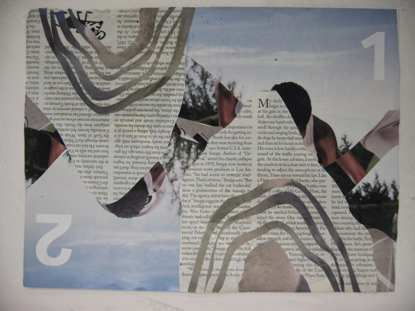
You will create and depict 2 different typographic and image compositions interpreting two of the four classical elements—earth, wind, fire, and water.

Air is the element of intellect, study, and book learning. It is also the element of youth, creativity, and spontaneity, and of communication and travel.
Fire is the element of strength and energy. It is also the element of passion, courage, protection, purification, transformation, destruction, chaos, and sex. 
Water is the element of wisdom, clarity, and common sense. It is also the element of emotion, intuition and divination. 
Earth is the element of stability, order and grounding. It is the element of beginnings and endings.


Due Dates (Critiques)

Samimy's Class: Wed, February 12th
Lambert's Class: Thurs, February 13th

Materials
• Bristol 9x12” format - 2 compositions
• glue - rubber cement, glue stick, elmer's glue
• scissors and xacto knives
• tons of good magazine images with color and type!

Process
Cut type specimens and images from magazines using conceptual thinking of how you would visually interpret the two elements you have selected. Combine interesting letters forms, titles and paragraphs from different sizes, thickness and shapes with images to design an appealing collage that conveys the element chosen.

Do not use any representational imagery. you should look for color relations, texture, pattern tonal value of the colors. so you must look through the image and consider it for shape and color. Please remember to design your cut outs as well, this has great impact on the aesthetics of the final composition. Be thoughtful about the figure ground relationships, color combinations to create an effective and convincing final product.

Think about different ways to represent your element of choice. How do you see fire, air, water earth? is it agitated, windy, passionate, arid... Is it tropical, desert, forest, is the water agitated, calm, is the air breezy, hurricane, tornado, etc... , what types of lines, shapes, color, composition, alignment... You need to use the scope of color values that exude the type of feeling you want to convey; you can combine type with images/shapes—but remember that these are typographic and image compositions.

Remember to also be very aware of designing your cuts and shapes. this has to be part of the process to achieve your desired results.

Use combination of type as imagery as well as textural cut outs that communicate your goal. The result will be 2 (pick 2 out of 4) interesting and appealing compositions.

Samples


Jan 21, 2014

Project 1: Mixed-Media Portraits: Due January 28/29

Purpose

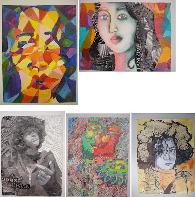
Create two mixed-media portraits on Bristol board. One self-portrait, and one portrait of a classmate. Through the process, you will begin to explore additive technique in two-dimensional art. In particular, you will experiment with integrating collage with traditional painting and drawing techniques. 

Attention will be given to the design principles we covered first semester. Namely: (F/G relationship, balance, composition, value, and color theory/relationships). All elements must work together to create a cohesive finished work. 

Due Dates (Critiques)

Lambert's Class: Tue, January 28th. 
Samimmy's Class: Wed, January 29th. 

Rubric

You will be assessed on your application of the design principles mentioned above, your craftsmanship, and your creativity. 


Materials

  • White Bristol board 18in. x 12in. This sheet will be cut into two 9in. x12in. pieces.
  • Paint, markers, colored pencils, etc.
  • Fabric scraps, magazine cutouts, thin metals, plastics, etc.
  • Appropriate adhesive (white glue, rubber cement, gel medium)

Process

Step 1
In your sketchbook, create 5 different contours (silhouettes) that you will use as a reference for your collage. 

Begin by drawing yourself with a mirror. Pay close attention to details, such as facial features, and their relative size and position to one another. Be sure to map all these elements out correctly. Use cropping and position on paper to create a dynamic composition.

Draw a silhouette of the head, then include neck and shoulders, add hair, include ears... Think about what you could add/remove to make it unique (pencil behind ear, sunglasses in hair, specific earring, etc)

Step 2
Now, focus on other areas of your body- hands, feet, legs, and entire figure. Repeat the steps above, to create 5 more contours from these observational drawings. 

Step 3
Tape the compositions to a wall, take a step back, and examine at your contours. Examine the positive/negative space, and composition, of each contour. Which are most successful? 

Now, look at the compositions alongside each other. Pay attention to the different ways the compositions interact with each other. How do they inform (relate and influence) each other? What combinations of compositions are particularly successful?

Step 4
Based on the observations in Step 3, choose one (or more) compositions to use as a starting point. Find ways to make the composition stronger, by overlapping, intersecting, combining, cutting, cropping, etc.  Continue to refine the composition by rearranging, adding, and deleting elements.

Step 5
Explore with different materials (paint, collage, markers, fabric, metal, etc), continuing to refine the composition. Use color, texture, and value to tie everything together. 

NOTE: THIS IS NOT A 3-D PROJECT; KEEP THE WORK 2-D.The bristol board must be able to physically support all the materials you have incorporated. 


Art-Historical Examples

Andy Warhol


Students Samples

Dec 5, 2013

Color Wheel


COLOR WHEEL: A color wheel (also referred to as a color circle) is a visual representation of colors arranged according to their chromatic relationship.


Dec 4, 2013

Color Combinations


Monochromatic Colors are shades (add black) or tints (add white) variations of the same hue. There is a risk of monotony but using it with pure colors, white or black can break that dullness.


Analog Colors lie on either side of any given color. Often these are color schemes found in nature so they usually feel harmonious.


Complimentary Color are directly opposite from one another on the color wheel. They are contrasting and stand out against each other; it is a good idea to use a complementary color as the highlight color.


Split C
omplementary Colors is a color and the analogous colors to its complement color. This combination give you a greater harmony than the use of the direct complementary and can give your design a higher degree of contrast.


Double-Complementary Colors are two complementary color sets; the distance between selected complementary pairs will effect the overall contrast of the final composition.


Triad Colors are three hues halfway on the color wheel. When you want a design that is colorful and yet balanced, a triad color scheme might be the way to go.

PROJECT 08 - COLOR RELATIONSHIP COMPOSITIONS USING COLOR WHEEL (COLOR THEORY)

Select a close up image from nature that has detailed areas of interest where you can see different design elements in the shapes of the image. With cropping L's (given in class), search for select areas in the image to create a balanced and interesting composition. Look beyond the actual literal image and visualize and interpret the shapes from the original image. Use your creativity to execute your original composition. Crop into it and create an abstraction creating your own version. You will be creating three of the same compositions using scale and color relationships.
Color Combination Studies Derived from the Color Wheel

Create three repetitive compositions on 9”x9” paper using three distinct color relationships from the color wheel. Repeat your composition on each one. Using paints, execute your compositions using the following color relationships, use saturated colors and their tones and tints. Do not use white or black. Select one hue as starting point and develop its relationships. Refer to the color wheel and the examples from the different combinations from the color wheel posted from the blog.

CHOOSE THREE COMBINATIONS OF RELATIONSHIPS:

     - Complimentary colors (Split or Double complimentary)
     - Analogous colors
     - Monochromatic colors
     - Triad

 Process
•  Sketch out 3-4 thumbnails for your desired composition. Experiment with pencil and play with color
    in your sketchbook so you can explore different relationships and color combinations.
•  Select the strongest one to execute your final 9”x9” painting.
•  Consult with teacher for final selection of strongest concepts.

Materials
• White Bristol 9”x9” format (3 final paintings)
• Paint (acrylic or gouache) with a wide range of saturated colors.


Check Georgia O’Keefe's work

Students Samples