Apr 16, 2015

PROJECT: Proportional Color Inventory. Due April 23rd Lambert, April 28th Samimy.

Description

There are colors everywhere- nature, architecture, artwork, design, etc. The goal of this exercise is to train your eye to pick out and recreate colors from the visual world around you.

Starting with a found image, you will generate a color inventory based on the 8-10 most used colors in the composition. These will be arranged in order from least-used, to most-used (and proportional).  

After making the inventory, you will create an abstract composition using the same colors, and in the same proportion, as the source image.  In addition to learning how to see, and duplicate color, this exercise will help you find color combinations that you might not otherwise consider, and aid in your ability to represent the countless tones of a visual source.


Due
Critique at start of class-  April 23rd Lambert, April 28th Samimy.


Process
Choose one image from the auction catalogues in class. Be sure to pick an image with somewhere between 8-10 various hues/colors. 

Try to find an image with color combinations that you usually don't use. You will use this to create your proportional color inventory. A proportional inventory will show the approximate measurement of colors present from dominant (greatest amount) to least dominant (smallest amount). 

PROPORTIONAL INVENTORY
Make a proportional inventory with countable number of tones (primed textiles, woodcuts, or silkscreen prints are good sources.)
Create a color palette (about 6 X 3 inches) that matches colors and estimates proportions. Design a composition of your own using the colors and proportions of the inventory.

Materials

  • Bristol 9"x12" for your abstract painting
  • White Poster Board for mounting
  • Magazine reproduction of art historical reference
  • Bristol 3"x9" for your proportional color inventory

Schedule

Day 1- Class time
  1. Find appropriate reproduction of art historical work from magazine.
  2. Create proportional Color Inventory.
  3. Begin thumbnails for abstract composition
Homework- 
  1. Complete a single page of thumbnails for your abstract composition. Be sure these have the same aspect ratio as the final (9"x12") compositon. The aspect ratio is 3x4.
  2. Using your best three thumbnails, create three comprehensive compositions showing value and placement of color. Be sure these maintain the 3x4 aspect ratio.
  3. Pick the best of these three compositions, and draw it out on your 9"x12" bristol board. This must be completed before coming to class.
Day 2- Class time
  1. Paint your final composition. 
  2. If you finish early, you may start mounting your work on the poster board.
Homework-
  1. Mount all elements (magazine image, color inventory, and your painting) on the white poster board. 

Demonstration


Students' samples


*This project is taken from David Hornung's Color: A workshop for artists and designers

Apr 2, 2015

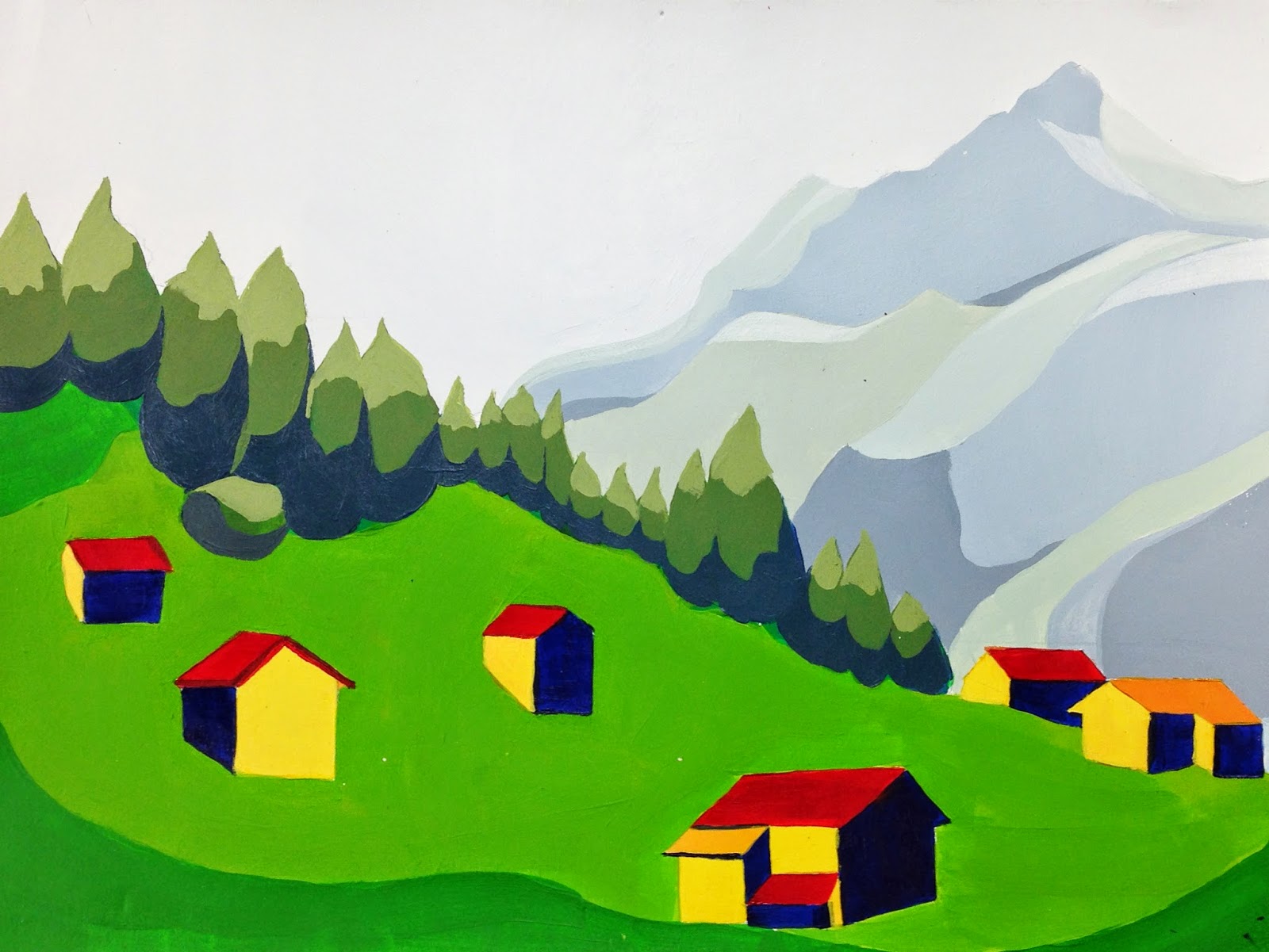
PROJECT: Atmospheric Perspective. Due April 13- Samimy, April 14- Lambert


Project Description

Create two paintings of  urban/architecture/cityscape that give the illusion of depth, using both linear and atmospheric perspective. You compositions will be drawn from life. You may take a photo of the composition to use as a reference for determining value (light/shadow). 

The goal of this project is to apply what you have learned throughout the year regarding color theory, the basic design components, composition, and painting technique to create a convincing landscape that shows depth.  


Schedule

Homework- Step A. 

Draw at least two pages of thumbnails (accurate and lots of variety). From these thumbnails, move on to 3 detailed comprehensive sketches for each 9x12 composition. 

You will need two pages of thumbnails, and 6 detailed comprehensive sketches before moving on with the painting. 

Note: Each of the three detailed sketches must be of a different cityscape, and from different viewpoints. These will be graded.

Homework- Step B. 

Choose the best two compositions and redraw them on 9x12 bristol board. Be sure to address the following compositional concerns:
  1. What will my main focal point(s) be? How can I use line, shape and color to direct the viewer there?
  2. How is my eye moving around the page? Is the composition 'broken'- meaning, does your eye get stuck anywhere? If so, how can I fix the composition?
  3. Do the lines, shapes, and colors work together to create a sense of depth?
Studio Day 1- color schemes and begin painting

Work on color schemes in your sketchbook. You must reference the color wheel when deciding on your colors. Have notes written in your sketchbook to answer the following questions:
  1. Which paints did you use to mix your colors? 
  2. What color schemes will you use, and where?(analogous in background, triad in middle ground, split compliment in foreground, etc) 
  3. How will you reduce the intensity/saturation as you move from foreground, through middle ground, to background? 
  4. How will you create more contrast in the foreground, and less in the background?
  5. Have you taken notes and written everything down?
Studio Day 2- Work on paintings. 

You will have 2 hours to paint your composition. Be sure to have your sketchbook notes and composition with you. 
1:10pm- set up paints, etc. while I review the assignment. 
1:30pm- painting session
3:30pm- clean up
3:45pm- dismissal

Studio Day 3- Finish paintings. 

You will have 2 hours to paint your composition. Be sure to have your sketchbook notes and composition with you. 
1:10pm- set up paints, etc. while I review the assignment. 
1:30pm- painting session
3:30pm- clean up
3:45pm- dismissal

Rubric

You will be assessed on both your process (time-management, being prepared, following all steps), and your finished project. 

Project will be graded according to: composition, your ability to create a sense of depth, craftsmanship/technique, and creativity. 

What is Atmospheric Perspective?

http://www.arthints.com/what-is-atmospheric-perspective/


Student Samples


Mar 10, 2015

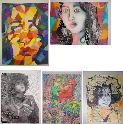
Project: Mixed-Media Portraits. Due 3/17 Lambert, 3/18 Samimy

Purpose

Create two mixed-media portraits on Bristol board. One self-portrait, and one portrait of a friend or family member. Through the process, you will begin to explore additive technique in two-dimensional art. In particular, you will experiment with integrating collage with traditional painting and drawing techniques. 

Attention will be given to the design principles we covered first semester. Namely: (F/G relationship, balance, composition, value, and color theory/relationships). All elements must work together to create a cohesive, resolved, and finished work. 

Due Dates (Critiques)

Lambert's Class: Tue, March 17th. 
Samimmy's Class: Wed, March 18th. 

Rubric

You will be assessed on your application of the design principles mentioned above, your craftsmanship, and your creativity. 

Note: All projects turned in after the due-date will be reduced by one letter grade. 


Materials

  • White Bristol board 18in. x 12in. This sheet will be cut into two 9in. x12in. pieces.
  • Paint, markers, colored pencils, etc.
  • Fabric scraps, magazine cutouts, thin metals, plastics, etc.
  • Appropriate adhesive (white glue, rubber cement, gel medium)

Process

Step 1
In your sketchbook, create 5 different contours (silhouettes) that you will use as a reference for your collage. 

Begin by drawing yourself with a mirror. Pay close attention to details, such as facial features, and their relative size and position to one another. Be sure to map all these elements out correctly. Use cropping and position on paper to create a dynamic composition.

Draw a silhouette of the head, then include neck and shoulders, add hair, include ears... Think about what you could add/remove to make it unique (pencil behind ear, sunglasses in hair, specific earring, etc)

Step 2
Now, focus on other areas of your body- hands, feet, legs, and entire figure. Repeat the steps above, to create 5 more contours from these observational drawings. 

Step 3
Tape the compositions to a wall, take a step back, and examine at your contours. Examine the positive/negative space, and composition, of each contour. Which are most successful? 

Now, look at the compositions alongside each other. Pay attention to the different ways the compositions interact with each other. How do they inform (relate and influence) each other? What combinations of compositions are particularly successful?

Step 4
Based on the observations in Step 3, choose one (or more) compositions to use as a starting point. Find ways to make the composition stronger, by overlapping, intersecting, combining, cutting, cropping, etc.  Continue to refine the composition by rearranging, adding, and deleting elements.

Step 5
Explore with different materials (paint, collage, markers, fabric, metal, etc), continuing to refine the composition. Use color, texture, and value to tie everything together. 

NOTE: THIS IS NOT A 3-D PROJECT; KEEP THE WORK 2-D.It can have lots of texture, and some depth, but the bristol board must be able to physically support all the materials you have incorporated. 


Art-Historical Examples

Andy Warhol


Students Samples

Feb 10, 2015

Project: Prismatic to Muted. In-class assignment

Project Description

This is an in-class project. You will create a composition based on a small still-life in class. The composition will be drawn out twice, using two sheets of bristol board (9 x 9in). Be as precise as possible, to make both compositions the same- use a grid to help layout the composition. 

When deciding on a composition, use cropping as a tool to develop an asymmetrical balance that considers both the foreground and background (figure/ground relationship). 

Your compositions will be painted in acrylic, using four or five different hues (colors). Different values of each hue should be used to develop contrast within your composition. 

Remember, contrast should be used to establish areas of interest. Also, be aware of light, darks, and mid tones. You can reference the value scale projects from the beginning of the year. 

Important

Each of the two compositions must maintain the same relative values, and shapes. They are to be the same in terms of color, shape, and value. The only difference: one will be Prismatic, and the other Muted.

When you mix your paints, think of a broad value range that extends from lights to darks. Mix different greys to your pure colors (hues) to get the proper tints, tones, shades. For this assignment, always mix your colors with grey (as opposed to white OR black).

When painting, be sure to block out your colors, and keep the colors flat (no brush strokes, shading, gradients). 


Paper size: 9 x 9 inches


Process

Homework:
30 mins- Prepare 10 thumbnails of composition ideas in your sketchbook (5 minimum).
40 mins- Draw out your compositions on the bristol board.

Classwork:
Paint muted composition. 
Stop at 3:30 for Clean-up and have students turn all projects in. Name should be on back.

Things to consider

This study should help you learn to see how light works in nature, and how light is reflected off objects. 

The following generalizations are often observed throughout the day:

Early Morning- nice muted colors and pastels
Mid Day- Nice bright prismatic colors
Dusk- darker muted colors and chromatic grays


Student Samples


Jan 22, 2015

Reference: The Four Levels of Saturation

The chart and definitions below introduce the four basic levels of saturation


PRISMATIC COLORS are as pure in hue as is possible with pigments. Once a pure color has been altered through color mixing, it ceases to be prismatic (except when the admixture is a closely related hue, as when mixing yellow-orange into yellow).

MUTED COLORS range from rich colors that lie just outside the prismatic zone, to the most saturated chromatic grays. One can create muted colors by adding black, white, or gray to a prismatic color. Adding the complement of a hue will also diminish its saturation and produce
muted color.

CHROMATIC GRAYS exhibit a subtle, yet discernible hue. Except for the proportions involved, they are mixed in exactly the same manner as muted colors. Chromatic grays simply require larger quantities of black, white, gray, or the complement.

ACHROMATIC GRAYS compose the inner circle of the color wheel. Grays mixed from black and white are achromatic because, like black and white, they lack perceptible hue and saturation. Achromatic grays can also be produced by precisely intermixing two complementary colors so that each hue cancels the other our. Insofar as a gray registers the slightest amount of perceptible hue it should be considered a chromatic gray.