Sep 5, 2017

PROJECT 03: TWO PART Assignment - 10 GRAYSCALE VALUE STUDIES / COMPOSITION Applying gray value scales

Due Dates (Week of September 11 contingent on weather conditions)
Section 1/Samimy: TBA - due to hurricane
Section 2/Samimy: TBA - due to hurricane

MUST WORK ON VALUE SCALES AND 6-8 THUMBNAIL STUDIES OF ORIGINAL DESIGN OVER THE CLOSING OF SCHOOL DUE TO IMPENDING WEATHER CONDITIONS.

Project Description

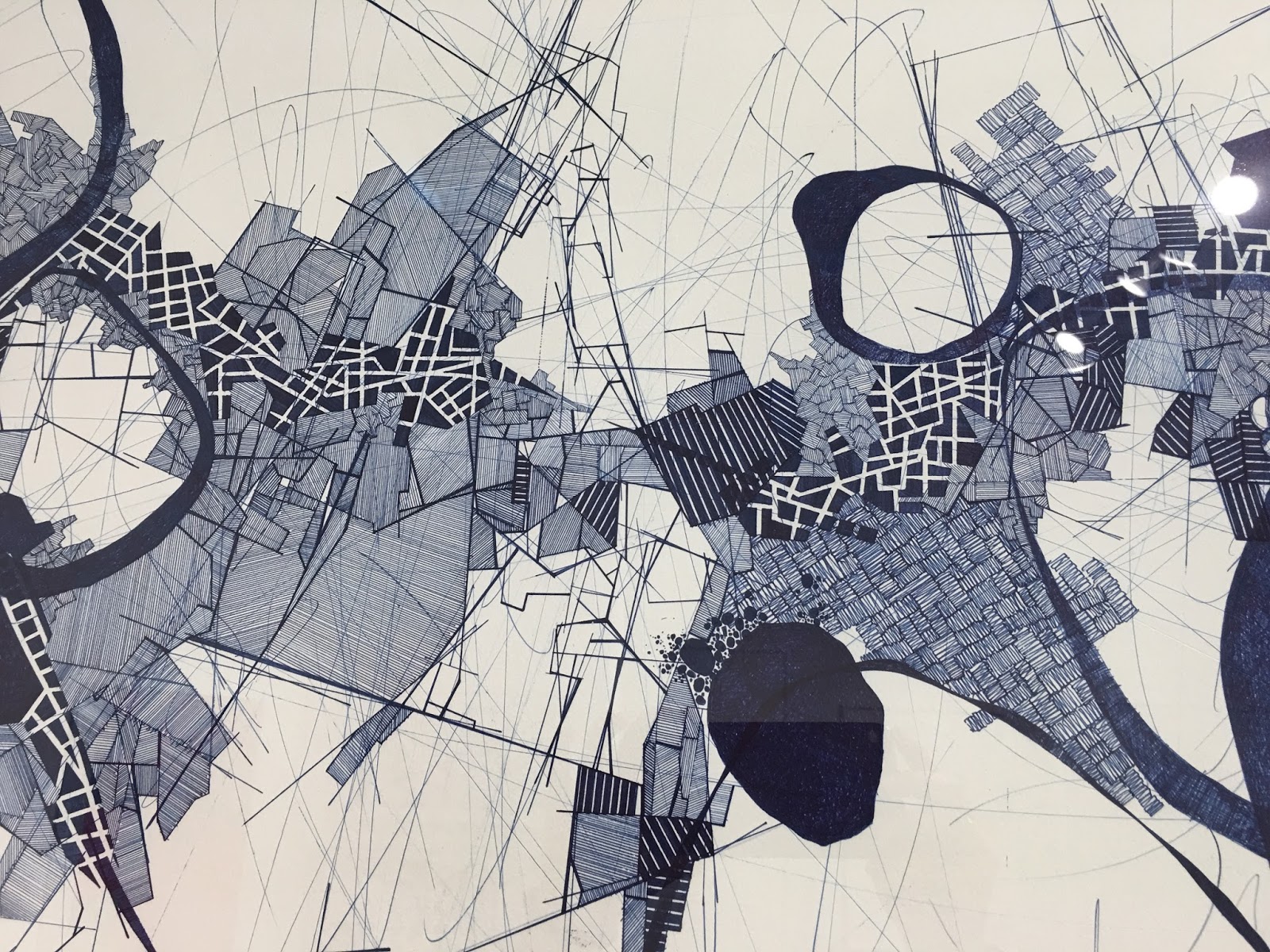
End goal of Project: You will Create 2 non-representational (abstract) compositions that show a wide rage of gray values using only pencil. You cannot use gradients within each shape. They must be continuous values of gray. You may also apply textural patterns and stippling that will also show value and contrast. (See reference below). You can inspire your designs from different elements of nature, or any other inspirational imagery. Must be interpretive or original designs.

Apply more pressure to obtain darker grays and less pressure for lighter gray values. pay attention to detail and craft. Remember no smudging to get the gray.

Materials Needed

• Graphite pencils - Range from hard leads - soft leads  (2H, HB, 2B, 4B,6B,)
• 9"x12" size paper (divide in 2 equal sections measuring 6"x9")

Demonstration links for developing 10 value graysale black-white:

https://www.youtube.com/watch?v=0QD0CUfL_pQ

https://www.youtube.com/watch?v=IzzRZE0LTPk

Process/Schedule

Day one (In-Class)
A. Presentation 
Short lecture going over the concept of value, shading techniques, and overview of compositional strategies. 

B. Value Scales
Practice your value scales in your sketchbooks. Each value scale should consist of ten levels ranging from black to white. Start by making a grid, 1/4" - 1/2" square, then shade each square individually. Be sure to keep the value consistent within each square, and keep the change in value consistent from square to square. Each square must show distinctive values. Fill at least one sketchbook page of scales studies.

10 Step Value Scale


C. Compositional  Sketches 
Once you adapt to using your pencil and it's various pressures, start doing approximately 3" x 5" thumbnails in your sketchbook- at least 6-8 thumbnail sketches developing ideas for the 2 compositions (total 6-8 thumbnails in sketchbook). You will be graded on this. AREAS SHOULD WORK IN SOME WHITE SPACE AND TEXTURAL MARKINGS. Sketches and design ideas will be due at the beginning of the next class.

D. Homework
Finish a full page of value scales, and at least 6 3" x 5" compositional sketches to be turned in at the beginning of class for review. Along with the full page of value scales, your DETAILED thumbnails will be graded for 50% of your total grade. DUE AT BEGINNING OF CLASS

Final Compositions (DUE AT END OF CLASS) Consult with your teacher via text or "remind" and also speak with your fellow students, to select the best two compositions for your final designs. These will be completed on the measured6"x9" bristol board divided in half on page. Remember to try and communicate two distinct ideas (this can be an emotion, nature, imagined design or anything else you can think of)

Rubric

Assessment is based on your creativity, composition, craftsmanship, time-management, and the completion of all steps of the process (8 preliminary sketches, 5 value scales, 2 finished compositions). Your final pieces must contain 10 steps in value from black to white. 


Students Samples


Aug 29, 2017

Project 02: Line - Organic / Geometric Compositions


Project Description
Create 2 non-representational (abstract = NOT RECOGNIZABLE objects in the drawing) line compositions that suggest variety in line, size, to create emphasis/contrast/heirachy. You must combine different types of line weights and density in lines to create successful designs but both compositions should be unique, one organic and one geometric. Be bold, risky and experimental! 

Due Dates (Critiques)

Mon/Wed, beginning of class:      Wednesday, September, 6th. (9/4-Labor Day)
Tues/Thurs, beginning of  class:   Tuesday, September 5 th. 

Materials

• Black mechanical pen - Various weights (Ultra Fine PointFine Point)
• White Bristol 9x12” paper (2 papers)  

Process

• Start by developing thumbnails with pencil in your sketchbook, at least 3 sketches
  for each composition.
• review ideas with your teacher; select the best direction.
• Create a series of 2 unique line compositions from your sketchbook thumbnails.


The two compositions should be well thought out. Think about the way your eye moves across the drawing. What direction does your eye move? What speed? Where are the focal points/points of interest. Be aware of framing, cropping, layout, positive/negative use, aesthetics. 

Be sure that each of your compositions are unified, Variety in line and shape to create contrast and emphasis... movement in composition not monotonous and static. Must be visually cohesive.

Lastly, be sure to use good craftsmanship. lines should be clean, varied line weights (think thin, medium, thicker, density, etc…) with no smudges, no sketched lines. Fluid lines, nothing unintentionally choppy. This is clean, graphic, work. See work below as reference. RESEARCH…

You can go to my pinterest board: ysamimy. board is 2D-art.

Students samples 


More samples

REFERENCE – ALL ABOUT THE LINES

Line is a mark connecting two points; you can consider a line as a moving point.

Types of line

ACTUAL LINE—The line

IMPLIED LINE—An automatically connected series of unconnected points.

PSYCHIC LINE—The placement of the objects causes the viewer to look in a certain direction.


Categories to describe lines
TYPES OF LINE—the way it moves from beginning to end (straight, curves, angular)
LINE DIRECTION—relationship with the page (horizontal, vertical, diagonals)
LINE QUALITY—how the line is draw and the drawing media (delicate or bold, smooth or broken, thick or thin, regular or changing)
Uses of Line • To define shapes (contour drawing/cross-contour)
• To create texture (evoking our sense of touch)
• To create patterns (repetition)
• To create value (parallel lines “hatching” /intersecting lines “cross-hatching” create various density)
• To convey a mood (linear technique)
• To suggest motion (differences in line weight)

Working with lines • Stop/Start
• Change in directions
• Overlap or intersect
• Change in line weight (thick and thin)
• Closer together, farther apart


Aug 20, 2017

REFERENCE: ELEMENTS AND PRINCIPLES OF ART ( IMPORTANT TERMINOLOGY)


Elements are the things that make up a painting, drawing, design... 
• Line is a dot (point) that moves through space. It's connects one point to another. Lines can organize, direct or separate. They can join elements or divide them. They can create shapes, be expressive, suggest an emotion, or create a rhythm. An actual line is clearly visible. An implied line is perceived by the viewer though not fully developed in the artwork.

• Shape is a self contained defined area of geometric or organic form. A shape is defined by lines or other elements elements of art. they can be simple or complex. The three basic shapes: the circle, the square, and the triangle are considered to be the fundamental shapes found in all design. 

• Color is the part of light that is reflected by the object we see. color is the portion of the electromagnetic energy that is visible to the human eye. of light that is reflected by the object we see. In 2D we mix pigments to create new colors. Color is defined by hue and value. Color is an element of art with Three properties.
1) HUE-pure color 
2) CHROMA-measurement of intensity (purity and strength) of the color 
3) VALUE-Relative lightness or darkness of the color.

• Value is the lightness or darkness of an area or object. It adds dimension by creating the illusion of depth. (there are 9 levels of value on a value scales from the darkness to lightest to white.

• Space refers to the distance between elements that creates positive or negative spaces in a composition. 

• Texture is the look and feel of a surface (rough, smooth, soft, hard, glossy, etc) and it can be physical (tactile) or visual (illusion). Texture adds richness and dimension to 2 dimensional artwork. 
• Typography is not only to read, letters can be used to create compositions.

Principles is what we do with these elements 
• Balance occurs when all the design elements are equally distributed through the design. There are essentially two types of balance: symmetrical and asymmetrical. 
• Contrast stresses the visual differences in size, shape, and color between the elements to enhance the perception of a message intended. Contrast also draws and directs the viewer's attention to specific areas. 
• Emphasis indicates the most important element because it attracts the viewer's attention first. 
• Rhythm is a pattern created by repeating elements. Rhythm also denotes the sequence to the viewing order. 
• Scale can attract in different ways. It can be use to draw attention to the unexpected or exaggerated. Overall size, monumental pieces are impact full while miniature has a sense of intimacy. Scale, alone, can change the meaning. 
• Unity is achieved when all the design elements relate to one another and project a sense of completeness. Artist and designers use the Gestalt Theory, the psychological process of perception, to create unity (also called harmony).

Apr 27, 2017

NON-PROPORTIONAL COLOR INVENTORY - DEADLINE: Wednesdaay, May 3 / Thursday, May 4

Create a well balanced abstract composition or interpretive portrait (color blocked) or creative landscape (consider foreground, middle ground, background). For all compositions, consider focal areas (emphasis, hierarchy), use all sides of page (edge to edge) when framing and cropping, assymetry, Figure/Ground relationships! don't put subjet in middle. Dynamic composition.

You selected your image. Analyze the overall color palette used and take an inventory of specific hues found in the image you are extracting color from. You must have at least 10-15 found colors to use from the reference art that you selected (create an inventory list). Break away from the colors you like and start training the eye to assess color objectively. Find color combinations that you might not otherwise consider and learn the ability to represent the countless tones of a visual source.

Create at least 3 sketches (showing color distribution), well balanced, creative composition. in your sketchbook as well, analyze and start applying colored areas in your sketches as a visual reference. use acrylic or watercolor on your drafts in your sketchbook preferably around the 6"x6" area you will be using as your square color palette. Practice some color mixing with the palette you selected to figure out the division how to mix the exact colors. Think about how the colors will interact in your composition. When mapping it out your colors, use light pencil to visualize color placement.

Materials
• Bristol board, 9x12"
• reference painting (from art books in closet)
• 6"x6" bristol square for swatch of colors
• All 3 pieces to be mounted on matte board (Reference Painting, color swatches, Final Composition)

Process
Find several pages from magazines, art reproductions, Paintings with color combinations that you usually don't use. You are going to create a non-proportional color inventory taking a careful inventory of the colors seen in the painting and mixing each color to match the original color in the your source image. Examine, analyze and map out the colors as well as thinking of your composition. you will create at least 3 sketches of ideas for composition. Be very aware of the areas of color placement, always considering values, contrast, highlights in composition. check hierarchy, focal areas, mapping out the colors you identified and where they will be used in painting with new color palette.

YOU WILL BE GRADED ON ALL STEPS OF THIS PROJECT. 

CREATING A NON-PROPORTIONAL INVENTORY
Make a non-proportional inventory with uncountable number of tones (images taken from the natural world or complex paintings are good sources) you will have to average out the main colors in the painting. Begin the inventory with a square of flat color, (about 6" X "6 inches) use a background color directly from the image. Try to match the colors you observe precisely, create between 10 and 15 different dots. Design a composition of your own using tones drawn from the non-proportional inventory.


Students' samples