Mar 30, 2016

MIXED-MEDIA / COLLAGE PORTRAITS - Due 4/6 and 4/7 2016

Purpose

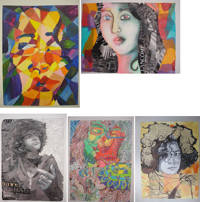
Create two mixed-media portraits on Bristol board. Think about the theme of your persona or your subject's persona and style in how you will approach the project. This is not about traditional portraiture, it's an interpretation as well, it's your original, unique vision, but it gives you the freedom to find creative solutions to the traditional portrait. think abstract, deconstruction, mixed media, collaging, material, overlapping and weaving in your elements in creating a strong compositional solution. You must find a way to integratae all the elements of your materials.

One self-portrait, and one portrait of a friend or family member. Through the process, you will begin to explore additive technique in two-dimensional art. In particular, you will experiment with integrating collaging with traditional painting and drawing techniques. MUST BE VISUALLY PLEASING (good aesthetics please). Think and analyze your process, method of execution and explore creative solutions. Be experimental.

Attention will be given to the design principles we covered first semester. Namely: (framing, Scale, Hierarchy, F/G relationship, balance, composition, value, contrast and color theory/relationships). All that we have studied thus far is crucial in creating a cohesive unified solution. How will everything tie in together to create a balanced composition. 

This project is treated as an abstraction and interpretive. not to be literal. All elements must work together to create a cohesive (unified), resolved, and finished work. Really think about your approach as in theme, style, be selective with materials and how to work them into your composition. Integrate the materials thinking of overlapping, layering, creating transparency in your finished piece. That can be done with different methods of layering mediums. You really need to analyze your piece and be visually aware of your AESTHETICS.

Due Dates (Critiques)

Mon/Wed Class: Wed, April 6th. 
Tues/Thurs Class: Thurs, April 7th. 

Rubric
You will be assessed on your application of the design principles mentioned above, your craftsmanship, and your creativity. 

Materials
  • Two Sheets of Bristol board 13in. x 10in. 
  • Paint, markers, colored pencils, charcoal, watercolors, etc.
  • Fabric scraps, tissue paper, magazine cutouts, string, yarn, newspaper, etc.
  • Appropriate adhesive (white glue, rubber cement, gel medium)

Process

Step 1
In your sketchbook, create 5 different contours (silhouettes) that you will use as a reference for your collage. 

Begin by drawing yourself with a mirror. Pay close attention to details, such as facial features, and their relative size and position to one another. Be sure to map all these elements out correctly. Use cropping and position on paper to create a dynamic composition.

Draw a silhouette of the head, then include neck and shoulders, add hair, include ears... Think about what you could add/remove to make it unique (pencil behind ear, sunglasses in hair, specific earring, etc)

Process to consider when creating your mixed media composition. Think abstract. Think creative. deconstruct. think of creating focal areas and how your eye travels through the piece.

Step 2
Focus on other areas of your body- hands, feet, legs, and entire figure. Repeat the steps above, to create 5 more contours from these observational drawings. 

Step 3
Tape the compositions to a wall, take a step back, and examine at your contours. Examine the positive/negative space, and composition, of each contour. Which are most successful? 

Now, look at the compositions alongside each other. Pay attention to the different ways the compositions interact with each other. Do they work as a pair? Are there similarities? Do they have elements that crossover? How do they inform (relate and influence) each other? What combinations of compositions are particularly successful? Of course they are not the same but they have similar styles that communicate to make them a pair.

You must Find ways to make the composition stronger, by overlapping, intersecting, combining, cutting, cropping, etc.  Continue to refine the composition by rearranging, adding, and deleting elements.

Step 4
Explore with different materials (paint, collage, markers, fabric, metal, etc), continuing to refine the composition. Use color, texture, and value to tie everything together. 

NOTE: THIS IS NOT A 3-D PROJECT; KEEP THE WORK 2-D.It can have lots of texture, and some depth, but the bristol board must be able to physically support all the materials you have incorporated. 

Research the terms: Assemblage, Mixed-Media, Collage. below are other references.

Art-Historical Examples


Students Samples


Feb 9, 2016

REFERENCE: Four levels of saturation

The chart and definitions below introduce the four basic levels of saturation


PRISMATIC COLORS 
are as pure in hue as is possible with pigments. Once a pure color has been altered through color mixing, it ceases to be prismatic (except when the admixture is a closely related hue, as when mixing yellow-orange into yellow).

MUTED COLORS 
range from rich colors that lie just outside the prismatic zone, to the most saturated chromatic grays. One can create muted colors by adding black, white, or gray to a prismatic color. Adding the complement of a hue will also diminish its saturation and produce
muted color.

CHROMATIC GRAYS 
exhibit a subtle, yet discernible hue. Except for the proportions involved, they are mixed in exactly the same manner as muted colors. Chromatic grays simply require larger quantities of black, white, gray, or the complement.

ACHROMATIC GRAYS 
compose the inner circle of the color wheel. Grays mixed from black and white are achromatic because, like black and white, they lack perceptible hue and saturation. Achromatic grays can also be produced by precisely intermixing two complementary colors so that each hue cancels the other our. Insofar as a gray registers the slightest amount of perceptible hue it should be considered a chromatic gray.

SAMPLES COLOR CHARTS BELOW SHOWING PROCESS OF LEVELS  OF TRANSFORMATION FROM A PURE SATURATED HUE DOWN TO CHROMATIC GRAYS.

THIS EXERCISE MUST BE PUT INTO PRACTICE IN SKETCHBOOK IN ORDER TO UNDERSTAND THE PROCESS AND THE GRADUAL SHIFTS FROM MUTED TO CHROMATIC GRAY.

This is to be analyzed and strategically applied to the composition exercises you are creating in class. 

You must apply the appropriate use of chroma considering range of values, different levels of muted hues  your composition. Use the muted composition as a guide to following the same hues and same values but using a chromatic gray palette. 

Result: 
TWO of the same compositions, same chroma,  same values. 
one using muted palette.
one using chromatic gray palette. 

Pay attention to the grayscale value scale as a guide to applying the different value shifts in each hue. IMPORTANT to compare grayscale value in relation to value in hue.  


Jan 27, 2016

PROJECT 01 - SELF-PORTRAIT USING HAND RENDERED TYPE (Spring Semester)

Due dates and critique:
Monday, February 1, 2016 / Tuesday, February 2, 2016

In this assignment you will create a self-portrait using free hand rendering type. You will be using your name or if you prefer your nick name or first name, what ever option you prefer, but only one of them. You will be using primarily black ultra-fine sharpie, pilot fine point marker, good ink pen, medium and thick points using them together to distinguish line weight when creating your composition. this is mainly to build out your highlights, mid-tones, shadows, shading, gradients. be aware of contrast in your composition, positioning of your portrait density in areas necessary. Be very aware of your positive and negative space, Figure/ground relationships, framing your subject, crops and aesthetics of composition. (rule of thirds). How the eye travels, points of interest. Focal point.

Pay attention to mark making and  craftsmenship. The more refined features that may be delicate require finer points etc…

Pay attention to details, shape and/or style to create different values and shapes in your composition. Remember your values... broad range of dark to gradual lighter pallette when appropriate, line weight, contrast, composition to create a dynamic self-portrait.

Materials
• Bristol 9x12” format

Process
Start with at least 4 different thumbnail sketches in your sketchbook and practice the way you will write out your name, etc. PRACTICE. Once you have an interesting composition move to the big paper. With light pencil and line drawing, Map out the areas where there will be highlights, mid tones and shadows. THis will give you an idea for framing your subject and areas that will be developed for your composition. The purpose of a light pencil sketch is to provide you with a guide to start developing from pencil and then apply the inks according to your needs.

It's important to be aware of the lettering used in the areas to create a notion of shading, blending, light areas, dense areas, etc… this creates contrast, volume, detention.

Samples


Dec 20, 2015

CHECK LIST FOR ALL PROJECTS TO BE PRESENTED FOR JURIES - JANUARY 2016

Please have all projects ready for presentations for Juries. Below is a an overview/checklist of all Projects that were to be completed for presentation.

Juries will be a final grade as well as all your sketch book assignments and appropriate deadlines met on time over the first semester.

GOOD LUCK! any questions just text me or download "whats app". I will be in france from December 20-January 2, 2016.

you need a minimum of 23 individual pieces for 2-d art, and present your 2 coconut grove paintings in progress so that we can all give you proper feedback on both paintings.

ALL assignments are on the blog so look back for specific instructions. no excuses.

- line weight projects: total: 3 - ink on paper - (1 in 4 sections in 1 sheet, 1 geometric, 1 organic sheet)

- Shapes, figure/ground relationships: total: 3 - 9"x9" black and white cut outs with construction paper. Stable, Ambiguous, Reversible. Based on 25% blk,  50% blk, 75% blk.

- Value studies in graphite pencil - total 3 - 6"x9" paper.

- Grayscale self-portraits in Paint. total: one. but you can do more using other hues and their values.

- 3 value scale compositions: red, blue, gray on 6x7 or 6x6 cut paper

- 3 formal value scales with 11 values in : red, blue, gray. total of 11 1"x2" mounted on strip in equal increments of approx 10% from black-white, blue-white, red-white. mounted on 4x13 white page with 1" borders all around.

- Platonic solids sculpture color theory project 

- 3 6x6 color relationship compositions (same compositions repeated 3 times using different color relations) choose from analogous, split-complimentary, double complimentary, triad, monochromatic.

Different composition using same color theory concepts:
- Design an additional 3 6x6 color relationship compositions (use that same composition repeated 3 times using different color relations) choose from analogous, split-complimentary, double complimentary, triad, monochromatic.

- Must present your 2 paintings for coconut grove in juries as well for review and feedback. you will be graded on this as well. must be pretty far along in order to give feedback.

You should have 23 pieces in total and your 2 coconut grove paintings and any additional work you would like to present. 

Please please refine, redo and resolve your body of work. all must be carefully crafted cleaned up and mounted according to what we spoke about. you may have to get some larger sheets of mounting paper from either Walgreens, CVS, office depot, stables, blick, artarama, artist and craftsmen, any store close to you that is reasonably priced.

You are also encouraged to create additional works relating to the class and present any work that you may have done that you would like us to look at. But all class assignments and additional assignments related to my class will be considered over the extra work.

If you had Mr. Travieso, you are also encouraged to produce more pieces if necessary. IF you are behind in my class, I expect to see all finished projects. If I don't see all projects fully resolved and presented, you will be graded according to the missing projects.

All Projects are ago be present from the first ones assigned at the beginning of semester through the final ones.

Below is the sample of the GRID for the Value scales. you need to me sure and cut the 2"x11" support strip to glue your swatches and also mount them on the 4"x13" thicker mounting board with a 1" boarder all around as we had done in class. if you have questions please communicate with your class mates during the break.


Dec 6, 2015

PROJECT 08 - COLOR RELATIONSHIP COMPOSITIONS USING COLOR WHEEL (COLOR THEORY)

DUE DATES: 
Monday/Tuesday, December 14th and 15th

IMPORTANT: You will do another series of three 6"x6" during the holiday break.
Both series of 3 designs will be presented for JURIES.

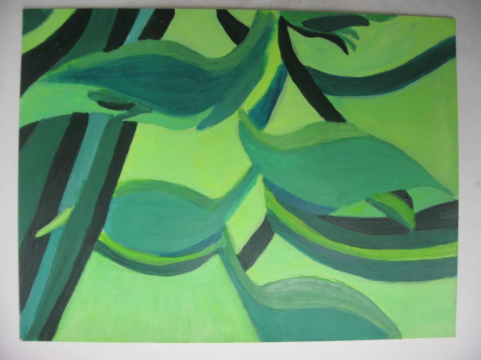
Create a series of 3 dynamic compositions (3 of the same). SELECT 3 DIFFERENT COLOR RELATIONSHIPS FROM The COLOR WHEEL FOR EACH ONE. Composition stays the same. color combinations change on each 6x6 drawing. 

Select 3 color relations out of 5 choices below. Identify the color relationship and the original hue and write the information on the back of each composition: 
analogous, monochromatic, split complimentary, double complimentary, triad.

Select an image or close up of image from nature that has detailed areas of interest where you can see different design elements in the shapes of the image. composition can be inspired from your own mind or inspired from the shapes of images that exist in nature. Look at the details. explore, look beyond just the simple image of, i.e…  a flower. Deconstruct the shapes and details, make them work together, reconstruct, interpret the shapes and create your own design. Nature has many dynamic shapes that can inspire ideas. Interpret and recreate your own version. You can use cropping L's or form a square with your hands to focus in and search for select areas in the image. The cropping is to show how scale works in relation to the page size which is 6"x6". Look beyond the actual literal image and interpret the shapes and apply to your drawing. Be creative and inspired.
You will be creating three of the same compositions with 3 different color relationships.

THREE (3) Color Relationship Studies will be chosen from the Color Wheel. 
ALL questions can be answered from these links below.
PLEASE READ AND RESEARCH!


Create three repetitive compositions on 6”x 6” paper using three different color relationships from the color wheel. Repeat same composition on each one. Using paints, execute your compositions using your chosen color relationships, use the pure saturated colors and their shades, tones and tints. you may use white or grays to lighten or desaturate the colors (muted colors). do not over use too much black to drown out the color.

To choose your color relationship, you will select your main hue as starting point and from that point, you will analyze and develop its relationships according to the color wheel. YOU must refer to the color wheel and the examples from the different combinations from the color wheel posted from the blog. Go back to the reference material on the color theory chapter of the blog. YOU MUST LEARN THE COLOR WHEEL AND ALL ITS RELATIONSHIPS.

CHOOSE THREE out of 5 COMBINATIONS OF RELATIONSHIPS: 

Start anywhere on the color wheel, but you must respect the color relationships that are created from the main hue chosen. DO not deviate from the color selections. Where do the colors fall when using each relationship. you are to stick to them but can use pure color and incorporate the shades, tones and tints of that particular hue.

     - Complimentary colors (Split or Double complimentary)
     - Analogous colors
     - Monochromatic colors
     - Triad

 Process / RECAP

•  Sketch out 6-8 thumbnails for your desired composition. Experiment with pencil and play with color
    in your sketchbook so you can explore different relationships and color combinations.
•  Write down your 3 final color relation selections and their proper color.
•  Select the strongest composition to execute your final 6”x 6” painting.
•  Consult with teacher for final selection of strongest concepts.

Again you will be graded on understanding of how to use color wheel and and it's color relationships, creativity, aesthetics, craftsmanship, use of color variations, range of values, hierarchy of shapes in your design, harmony within the composition. Clean edges, solid, flat colors, no shading. brush strokes. Be clean and neat.

Materials
• White Bristol 6”x6” format (3 final paintings)
• Paint with a wide range of values from the pure saturated colors including the tints tones and shades. All solid, flat colors. no blending. clean, well defined shapes. be aware of clean edges. clean shapes.
• Mounted as a series on white or black board, centered, with 1" margins


Check Georgia O’Keefe's work

Students Samples:

Focus on the individual compositions. look at repetition and the different color selections and how they are used. This is past work from prior 9th grade classes. Study them.