Showing posts with label solid flat colors. Show all posts

Sep 20, 2020

PROJECT 03: 10 GRAY VALUE SCALES / 2 VALUE COMPOSITIONS Apply gray value scales

Due Dates 

Section 1/Samimy: Final Due Date: MONDAY, Sept. 23
Section 2/Samimy: Final Due Date: TUESDAY Sept. 24

Please work on Value scale studies in using full page sketchbook.

Demonstration links for developing 10 value graysale black-white:

https://www.youtube.com/watch?v=IzzRZE0LTPk
 
Value Scales
learn about the concept of value, shading techniques, and overview of compositional strategies. 
Practice your value scales in your sketchbooks. Each value scale should consist of ten levels ranging from black to white. Start by making a grid, 1/4" - 1/2" square, then shade each square individually. Be sure to keep the value consistent within each square, and keep the change in value consistent from square to square. Each square must show distinctive values. Fill at least one sketchbook page of scales studies.

10 Step Value Scale


WORK ON VALUE SCALES AND 3-5 THUMBNAIL STUDIES OF AN ORIGINAL DESIGN.

PROJECT DESCRIPTION

End goal of Project:  You will Create 2 non-representational (abstract) compositions that show a wide rage of gray values using only pencil. You cannot use gradients within each shape. They must be continuous values of gray. BLOCK OUT YOUR SHAPES WITH SOLID GRAY VALUES. You may also apply textural patterns and stippling that will also show value and contrast. (See reference below). You can inspire your designs from different elements of nature, or any other inspirational imagery. Must be interpretive or original designs.

Apply more pressure to obtain darker grays and less pressure for lighter gray values. pay attention to detail and craft. Remember no smudging to get the gray.

Materials Needed
• Graphite pencils - Range from hard leads - soft leads  (2H, HB, 2B, 4B,6B,)
• Divide page in 2 equal sections measuring

Compositional  Sketches 
Once you adapt to using your pencil and it's various pressures, start doing approximately 3" x 5" thumbnails in your sketchbook- at least 3-5 thumbnail sketches developing ideas for the 2 compositions (total 4-6 thumbnails in sketchbook). You will be graded on this. AREAS SHOULD WORK IN SOME WHITE SPACE AND TEXTURAL MARKINGS. Sketches and design ideas will be due at the beginning of the next class.

Finish a full page of value scales STUDIES AND  compositional sketches to be reviewed at the beginning of class. Along with the full page of value scales, your DETAILED thumbnails will be graded as a part of your total grade. DUE AT BEGINNING OF CLASS

Final Compositions (DUE AT BEGINNING OF NEXT CLASS) Consult with your teacher via text or "remind" and also speak with your fellow students, to select the best two compositions for your final designs. These will be completed on the measured about 6"x9" bristol board or sketchbook divided in half on page. Remember to try and communicate two distinct ideas (this can be an emotion, nature, imagined design or anything else you can think of)You must use at least 5-7 shades of grays incorporated in your compositions.

Rubric
Assessment is based on your creativity, composition, craftsmanship, time-management, and the completion of all steps of the process (4-6 preliminary sketches, 5 value scales, 2 finished compositions). Your final pieces must contain 10 steps in value from black to white. 


Students Samples


Sep 11, 2019

PROJECT 03: TWO PART Assignment - 10 GRAYSCALE VALUE STUDIES / COMPOSITION Applying gray value scales

Due Dates 
Section 1/Samimy, Due Date: MONDAY, Sept. 16
Section 2/Samimy: Due Date: TUESDAY Sept.17

MUST WORK ON VALUE SCALES AND 4-6 THUMBNAIL STUDIES OF ORIGINAL DESIGN OVER THE CLOSING OF SCHOOL DUE TO IMPENDING WEATHER CONDITIONS.

Project Description

End goal of Project:  You will Create 2 non-representational (abstract) compositions that show a wide rage of gray values using only pencil. You cannot use gradients within each shape. They must be continuous values of gray. BLOCK OUT YOUR SHAPES WITH SOLID GRAY VALUES. You may also apply textural patterns and stippling that will also show value and contrast. (See reference below). You can inspire your designs from different elements of nature, or any other inspirational imagery. Must be interpretive or original designs.

Apply more pressure to obtain darker grays and less pressure for lighter gray values. pay attention to detail and craft. Remember no smudging to get the gray.

Materials Needed

• Graphite pencils - Range from hard leads - soft leads  (2H, HB, 2B, 4B,6B,)
• 9"x12" size paper (divide in 2 equal sections measuring 6"x9")

Demonstration links for developing 10 value graysale black-white:

https://www.youtube.com/watch?v=0QD0CUfL_pQ

https://www.youtube.com/watch?v=IzzRZE0LTPk

Process/Schedule

Day one (In-Class)
A. Presentation 
Short lecture going over the concept of value, shading techniques, and overview of compositional strategies. 

B. Value Scales
Practice your value scales in your sketchbooks. Each value scale should consist of ten levels ranging from black to white. Start by making a grid, 1/4" - 1/2" square, then shade each square individually. Be sure to keep the value consistent within each square, and keep the change in value consistent from square to square. Each square must show distinctive values. Fill at least one sketchbook page of scales studies.

10 Step Value Scale


C. Compositional  Sketches 
Once you adapt to using your pencil and it's various pressures, start doing approximately 3" x 5" thumbnails in your sketchbook- at least 4-6 thumbnail sketches developing ideas for the 2 compositions (total 4-6 thumbnails in sketchbook). You will be graded on this. AREAS SHOULD WORK IN SOME WHITE SPACE AND TEXTURAL MARKINGS. Sketches and design ideas will be due at the beginning of the next class.

D. Homework
Finish a full page of value scales STUDIES AND  compositional sketches to be turned in at the beginning of class for review. Along with the full page of value scales, your DETAILED thumbnails will be graded for 50% of your total grade. DUE AT BEGINNING OF CLASS

Final Compositions (DUE AT BEGINNING OF CLASS) Consult with your teacher via text or "remind" and also speak with your fellow students, to select the best two compositions for your final designs. These will be completed on the measured6"x9" bristol board divided in half on page. Remember to try and communicate two distinct ideas (this can be an emotion, nature, imagined design or anything else you can think of)You must use at least 5-7 shades of grays incorporated in your compositions.

Rubric

Assessment is based on your creativity, composition, craftsmanship, time-management, and the completion of all steps of the process (4-6 preliminary sketches, 5 value scales, 2 finished compositions). Your final pieces must contain 10 steps in value from black to white. 


Students Samples


Oct 2, 2018

PROJECT 04 - Exercise producing a complete value grayscale - Mounted on White presentation board


From these 96 total swatches, which are 2 carefully measured gridded sheets, 1'x1' squares, you will create a value scale representing TEN EVEN steps from black  to white. black and white with eight even incremental changes in-between.

Mount your swatches on presentation board for critique. Result is 1"x1" squares mounted on a 2"x11" white board.

Demonstration video


Materials
-Mars Black and Titanium White acrylic
-9x12 inch bristol board x 2
-Pallet knife
-1" Brush (bright)
-2 cups (for water)
-Paint palette (aluminum foil)
-Paper Towels
Process/Schedule


First Class Period
  1. Lay out grid (to create your swatches) on bristol board. 2 sheets total if you succeed to create a wide range of well painted solid values. You will need a 3rd page.
  2. Grid will have a total of 24 rectangular swatches per page, each measuring 1"x2" with 1/2" space in-between each rectangle. 3 swatches across top of 9"x12" page and 8 swatches down the length of page. Total swatches per page = 24
  3. Lay separatley black and white paints out on palette, and mix paints starting from black (or white) and adding incremental amounts of the opposite color. Mix paint throughly with palette knife and then brush until well mixed and you have a solid tone and brush-in swatches to fill the entire page. Must paint with smooth strokes, no streaks and an opaque thick coat of paint for full coverage. may have to use a couple of coats of paint to achieve a smooth clean opaque gray tone.
  4. Each swatch should have consistent color, and be a unique value. Must paint 3-4 of same values. The more variety of values you paint e, the easier it will be to select 11 strong swatches to create the final value scale.
  5. The goal is to create as many distinct values as you can. Fill in each rectangle of your grid with a solid value. Paint slightly beyond the borders. you must still be able to see original guides as you will be carefully cutting out each swatch one by one with an exact blade.
  6. Be sure you have all 10 values represented from from black (straight from the tube) progressing to middle gray, and continuing through light grays toward bright white (also straight from the tube). 
  7. Clean your workspace and all your painting materials (brushes, palettes, etc)

Second Class Period
  1. Finish painting your two pages of value swatches. You may need more than 2 pages.
  2. Lay out your presentation board, using the guidelines provided below.
  3. With a metal ruler, and cutting board, carefully cut-out your painted swatches so they are exactly the same size (1" x 1"). Cut very carefully following the guides you measured out. Makes life easier and cuts will be much more exact. Make sure cuts are clean, by using a new x-acto blade. NO CUTTING DIRECTLY ON TABLES. Cutting boards must be used. These have to be as close to perfect as possible.

Homework

  1. Finish laying out your black presentation board, using the guidelines provided. 
  2. Bring your presentation board to class, along with your x-acto knife. 
  3. Finish cutting out your swatches, if not finished in class.
  4. You may first glue your swatches on a strip of 1"x11" as a safety net to make sure all swatches are glued right next to each other and follow a straight pattern vertically.

Final Class Period
  1. Select the best swatches from your entire page that represent 11 consistent steps in value. 
  2. Show your presentation board (with layout lines/grid) to instructor. Once it has been given the ok, proceed with mounting of swatches. DO NOT PROCEED UNTIL YOUR LAYOUT HAS BEEN APPROVED.
  3. Using rubber cement, glue stick or regular glue, carefully glue swatches to presentation board. There should be no gaps between swatches, and all swatches should be perfectly aligned. 
  4. Let rubber cement dry slightly, and remove any excess glue with the appropriate eraser. 
  5. Neatly Label (name and date) your work with hard pencil in lower right-hand corner. 
  6. Cut and tape tissue paper sheet to act as protector. 
The final 30 mins of class will be reserved for critique.

Rubric


You will be evaluated on the following:

1. Laying out your bristol board into an even grid (even measurements, straight lines).
2. Your ability to mix the paints evenly. 
3.  Painting swatches that are free of brush strokes, or excessive paint build up.
4.  Filling up your entire page with different/distinct values.
5. Choosing the best 10 swatches that represent even steps from black to white. 
6. Laying out your presentation board neatly (consistent measurements, and centered)
7. Cutting out your swatches, and mounting them to the presentation board. 
8. Removing excess glue and having all your swatches line up evenly. 

Layout Measurements

Below is the sample of the GRID for the Value scales. you need to be sure and cut the 1"x10" support strip to glue your swatches and also mount them on the 2"x11" thicker mounting board with a 1/2" boarder all around as we had done in class. if you have questions please ask me or communicate with your class mates for information.


Nov 7, 2017

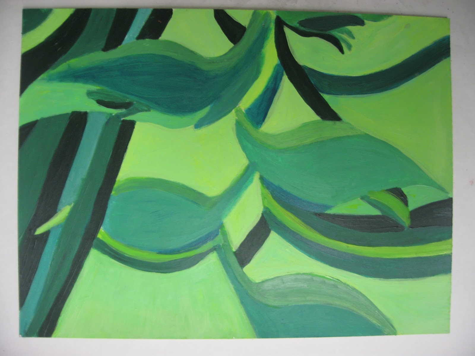
PROJECT 07 - COLOR RELATIONSHIP COMPOSITIONS USING COLOR WHEEL (COLOR THEORY)

DUE DATES: 
Wednesday/Thursday, November 15th /16th 

IMPORTANT: You will be responsible for an additional series of three 9"x12" during the holiday break. Both series of 3 designs will be presented for JURIES.

Create a series of three dynamic compositions (3 of the same). Select 3 different combinations of COLOR RELATIONSHIPS from color wheel for your compositions. You will find the descriptions below from the links provided. Composition will remain the same on all three. Changes will happen with the selection from three of the six different color combinations. 

Next: Select 3 color relationships from the 6 choices below (info provided from links and reference info below). Identify the color relationship and the original hues and write the information on the back of each composition with your name: 

Formal color relationships: analogous, monochromatic, complimentary, split complimentary, double complimentary, triad.

Inspire yourself with images from nature, anything that has interesting details you can reference to build your concepts. You will be required to find a close up of image from nature or other non-represntational elements that has detailed areas of interest where you can see different design elements in the shapes of the image. This an interpretive composition. Use this as your blueprint to draw from. It can be inspired from your own creativity or from the shapes of images that exist in nature. Look at the details. explore, look beyond just the simple image of, i.e…  a flower, leaves, shattered glass, grid systems, etc... Deconstruct the shapes and details, make them work together, reconstruct, interpret the shapes and create your own design. Nature has many dynamic shapes that can inspire ideas. Interpret and recreate your own version. You can use cropping L's or form a rectangle with your hands to focus in and search for select areas in the image. The cropping is to show how scale works in relation to the page size which is 9"x12". Look beyond the actual literal image and use the shapes to elaborate on your ideas for your drawing. Be creative and inspired. Again, variations in size of shapes, create focal areas, unity, flow, cohesive, deconstruct, interpretive, flat colors, solid colors, use contrast in size of shapes, focal areas, scale, broad range of values. Use your judgement on Aesthetics and provide creative visiual solutions please.

THREE (3) Color Relationship Studies will be chosen from the Color Wheel. 
ALL questions can be answered from these links below.
PLEASE READ AND RESEARCH!


Create three repetitive compositions on 9”x 12” paper using the three different color relationships from the color wheel. Repeat same composition on each one. Using paints, execute your compositions using your chosen color relationships, use the pure saturated colors and their shades, tones and tints. you may use white to lighten or desaturate the colors (muted colors).

To choose your color relationship, you will select your main hue as starting point and from that point, you will analyze and develop its relationships according to the color wheel. YOU must refer to the color wheel and the examples from the different combinations from the color wheel posted from the blog. Go back to the reference material on the color theory chapter of the blog. YOU MUST LEARN THE COLOR WHEEL AND ALL ITS RELATIONSHIPS.

Start anywhere on the color wheel, but you must respect the color relationships that are created from the main hue chosen. DO not deviate from the color selections. Where do the colors fall when using each relationship. you are to stick to them but can use pure color and incorporate tones and tints of that particular hue.

    - Complimentary colors
    - Split Complimentary colors
    - Double Complimentary colors
    - Analogous colors - Colors next to each other on the color wheel
    - Monochromatic colors
    - Triad

 Process / RECAP

•  Sketch out 4-6 different thumbnails for your desired composition. as many sketches needed to find
   the right solution for your painting. Experiment with pencil and play with color (color pencils or
   paint or watercolor) in your sketchbook so you can explore and figure out how the different
   relationships work together. Map out your sketch with light pencil drawing to insure placement
   of hues.
•  Write down your 3 final color relation selections and their proper color.
•  Select the strongest composition to execute your final 9”x 12” painting.
•  Consult with teacher for final selection of strongest concepts.

Again you will be graded on understanding of how to use color wheel and and it's color relationships, creativity, aesthetics, craftsmanship, use of color variations, use range of values, hierarchy of shapes in your design, harmony within the composition. Clean edges, solid, flat colors, no shading, Clean brush strokes. Be clean and neat.

Materials
• White Bristol 9”x12” format (3 final paintings)
• Paint with a wide range of values from the pure saturated colors including the tints tones and shades. All solid, flat colors. no blending. clean, well defined shapes. be aware of clean edges. clean shapes.

Check Georgia O’Keefe's work

Students Samples:

Focus on the individual compositions. look at repetition and the different color selections and how they are used. This is past work from prior 9th grade classes. Study them.


Sep 26, 2016

PROJECT 04 - Exercise producing a complete value grayscale - Mounted on WHite presentation board


From these 72 total swatches, which are 3 carefully measured gridded sheets, you will create a value scale representing TEN EVEN steps from black  to white. black and white with eight even incremental changes in-between.

Mount your swatches on presentation board for critique.


Demonstration video


Materials
-Mars Black and Titanium White acrylic
-9x12 inch bristol board x 2
-Pallet knife
-1" Brush (bright)
-2 cups (for water)
-Paint palette (aluminum foil)
-Paper Towels
Process/Schedule


First Class Period
  1. Lay out grid (to create your swatches) on bristol board. 2 sheets total if you succeed to create a wide range of well painted solid values. You will need a 3rd page.
  2. Grid will have a total of 24 rectangular swatches per page, each measuring 1"x2" with 1/2" space in-between each rectangle. 3 swatches across top of 9"x12" page and 8 swatches down the length of page. Total swatches per page = 24
  3. Lay separatley black and white paints out on palette, and mix paints starting from black (or white) and adding incremental amounts of the opposite color. Mix paint throughly with palette knife and then brush until well mixed and you have a solid tone and brush-in swatches to fill the entire page. Must paint with smooth strokes, no streaks and an opaque thick coat of paint for full coverage. may have to use a couple of coats of paint to achieve a smooth clean opaque gray tone.
  4. Each swatch should have consistent color, and be a unique value. Must paint 3-4 of same values. The more variety of values you paint e, the easier it will be to select 11 strong swatches to create the final value scale.
  5. The goal is to create as many distinct values as you can. Fill in each rectangle of your grid with a solid value. Paint slightly beyond the borders. you must still be able to see original guides as you will be carefully cutting out each swatch one by one with an exact blade.
  6. Be sure you have all 10 values represented from from black (straight from the tube) progressing to middle gray, and continuing through light grays toward bright white (also straight from the tube). 
  7. Clean your workspace and all your painting materials (brushes, palettes, etc)

Second Class Period
  1. Finish painting your two pages of value swatches. You may need more than 2 pages.
  2. Lay out your presentation board, using the guidelines provided below.
  3. With a metal ruler, and cutting board, carefully cut-out your painted swatches so they are exactly the same size (1" x 2"). Cut very carefully following the guides you measured out. Makes life easier and cuts will be much more exact. Make sure cuts are clean, by using a new x-acto blade. NO CUTTING DIRECTLY ON TABLES. Cutting boards must be used. These have to be as close to perfect as possible.

Homework

  1. Finish laying out your black presentation board, using the guidelines provided. 
  2. Bring your presentation board to class, along with your x-acto knife. 
  3. Finish cutting out your swatches, if not finished in class.
  4. You may first glue your swatches on a strip of 2"x11" as a safety net to make sure all swatches are glued right next to each other and follow a straight pattern vertically.


Final Class Period
  1. Select the best swatches from your entire page that represent 11 consistent steps in value. 
  2. Show your presentation board (with layout lines/grid) to instructor. Once it has been given the ok, proceed with mounting of swatches. DO NOT PROCEED UNTIL YOUR LAYOUT HAS BEEN APPROVED.
  3. Using rubber cement, carefully glue swatches to presentation board. There should be no gaps between swatches, and all swatches should be perfectly aligned. 
  4. Let rubber cement dry slightly, and remove any excess glue with the appropriate eraser. 
  5. Neatly Label (name and date) your work with hard pencil in lower right-hand corner. 
  6. Cut and tape tissue paper sheet to act as protector. 
The final 30 mins of class will be reserved for critique.

Rubric


You will be evaluated on the following:

1. Laying out your bristol board into an even grid (even measurements, straight lines).
2. Your ability to mix the paints evenly. 
3.  Painting swatches that are free of brush strokes, or excessive paint build up.
4.  Filling up your entire page with different/distinct values.
5. Choosing the best 10 swatches that represent even steps from black to white. 
6. Laying out your presentation board neatly (consistent measurements, and centered)
7. Cutting out your swatches, and mounting them to the presentation board. 
8. Removing excess glue and having all your swatches line up evenly. 

Layout Measurements

Below is the sample of the GRID for the Value scales. you need to me sure and cut the 2"x11" support strip to glue your swatches and also mount them on the 4"x13" thicker mounting board with a 1" boarder all around as we had done in class. if you have questions please communicate with your class mates during the break.


Sep 13, 2016

PROJECT 05: Self-Portrait in Greyscale. Using B/W Acrylic Paints (refer back to your value scales)

Project Description

Create a 9" x 12" self-portrait or portrait of classmate in B/W Acrylic applying the value scales you just finished. You may use one or a combination of a couple of tools to create a well executed portrait using a good range of gray scale value system.

Have fun with expressions, angles, framing to create a unique image to draw out for your 4 thumbnail sketches and keep in mind, you will select one of the four images you worked through as your final composition. be creative. 

Practice using a value scale in graphite, or pen/marker using clean cross hatch or hatch lines. Use the value scale you created as a reference to achieve 9 different values in your composition. 

There will be no blending/shading of paint with this assignment, instead break the image down into shapes that represent the changes in value. You will be creating solid shapes (blocking out fields) each value in the gray value scales. there will be 9 value distinctions in the final compositions. 

Be very aware of your placement, layout, figure ground, cropping, interesting angles and vantage points. Be creative in how you create your self portrait. Use lighting to create more dramatic shadows, mid tones and highlights. be aware of your light source and how it plays with the details on your face when mapping out the value fields. 


Value Scale Technique - Training Videos

Important for creatig value scale in pencil: 
https://www.youtube.com/watch?v=0QD0CUfL_pQ


https://www.youtube.com/watch?v=WowABJEpm1c

https://www.youtube.com/watch?v=B-jkKJmSW_8

Class Schedule

Homework Due in class on October 16 / October 17
1. Create four  distinct/different comprehensive sketches showing unique options for your portrait. Use cropping, directional light source, and framal reference, to create the most dynamic and interesting composition possible. If you need to do more sketches to resolve your piece, you will have to do more than just four. 

Do not limit yourself if you are still not satisfied with the direction of your portrait. 

2. Have your final composition drawn out on 9" x 12" bristol board, and map and block out all the fields values ranging from black (#9) to white (#1). 

Note: You will receive a full project grade on your homework meaning your 4 different sketches and studies. This will be reviewed and graded at the beginning of class.

Class work-time (October  18 / October 19)
You will have the full class time to select and work on creating your final portrait. This assignment will be worked on  during class time. Be sure to use your studio time well. and be productive. you will also ALWAYS receive a class grade based on your productivity in each class. Use your time wisely. everything is worked into your final project grade and class grade.

Note: Assignments will be collected and graded at end of class.

Critique (Oct 23  / Oct 24)
Please hang work and be prepared to start critique at beginning of class.  This will be a quick critique. We will start on the next project for the second half of the class.

Rubric

You will be assessed on the overall composition (dynamic and interesting), craftsmanship (even  surface with good tonal value fields using value as highlights, mid tones and shadows, clean edges on paper, no marks/dirt on paper), and range of value (full range of values from black to white- with 9 steps). Use continuous even lights mediums darks shades on each field that you black out. 

Student Examples


Dec 6, 2015

PROJECT 08 - COLOR RELATIONSHIP COMPOSITIONS USING COLOR WHEEL (COLOR THEORY)

DUE DATES: 
Monday/Tuesday, December 14th and 15th

IMPORTANT: You will do another series of three 6"x6" during the holiday break.
Both series of 3 designs will be presented for JURIES.

Create a series of 3 dynamic compositions (3 of the same). SELECT 3 DIFFERENT COLOR RELATIONSHIPS FROM The COLOR WHEEL FOR EACH ONE. Composition stays the same. color combinations change on each 6x6 drawing. 

Select 3 color relations out of 5 choices below. Identify the color relationship and the original hue and write the information on the back of each composition: 
analogous, monochromatic, split complimentary, double complimentary, triad.

Select an image or close up of image from nature that has detailed areas of interest where you can see different design elements in the shapes of the image. composition can be inspired from your own mind or inspired from the shapes of images that exist in nature. Look at the details. explore, look beyond just the simple image of, i.e…  a flower. Deconstruct the shapes and details, make them work together, reconstruct, interpret the shapes and create your own design. Nature has many dynamic shapes that can inspire ideas. Interpret and recreate your own version. You can use cropping L's or form a square with your hands to focus in and search for select areas in the image. The cropping is to show how scale works in relation to the page size which is 6"x6". Look beyond the actual literal image and interpret the shapes and apply to your drawing. Be creative and inspired.
You will be creating three of the same compositions with 3 different color relationships.

THREE (3) Color Relationship Studies will be chosen from the Color Wheel. 
ALL questions can be answered from these links below.
PLEASE READ AND RESEARCH!


Create three repetitive compositions on 6”x 6” paper using three different color relationships from the color wheel. Repeat same composition on each one. Using paints, execute your compositions using your chosen color relationships, use the pure saturated colors and their shades, tones and tints. you may use white or grays to lighten or desaturate the colors (muted colors). do not over use too much black to drown out the color.

To choose your color relationship, you will select your main hue as starting point and from that point, you will analyze and develop its relationships according to the color wheel. YOU must refer to the color wheel and the examples from the different combinations from the color wheel posted from the blog. Go back to the reference material on the color theory chapter of the blog. YOU MUST LEARN THE COLOR WHEEL AND ALL ITS RELATIONSHIPS.

CHOOSE THREE out of 5 COMBINATIONS OF RELATIONSHIPS: 

Start anywhere on the color wheel, but you must respect the color relationships that are created from the main hue chosen. DO not deviate from the color selections. Where do the colors fall when using each relationship. you are to stick to them but can use pure color and incorporate the shades, tones and tints of that particular hue.

     - Complimentary colors (Split or Double complimentary)
     - Analogous colors
     - Monochromatic colors
     - Triad

 Process / RECAP

•  Sketch out 6-8 thumbnails for your desired composition. Experiment with pencil and play with color
    in your sketchbook so you can explore different relationships and color combinations.
•  Write down your 3 final color relation selections and their proper color.
•  Select the strongest composition to execute your final 6”x 6” painting.
•  Consult with teacher for final selection of strongest concepts.

Again you will be graded on understanding of how to use color wheel and and it's color relationships, creativity, aesthetics, craftsmanship, use of color variations, range of values, hierarchy of shapes in your design, harmony within the composition. Clean edges, solid, flat colors, no shading. brush strokes. Be clean and neat.

Materials
• White Bristol 6”x6” format (3 final paintings)
• Paint with a wide range of values from the pure saturated colors including the tints tones and shades. All solid, flat colors. no blending. clean, well defined shapes. be aware of clean edges. clean shapes.
• Mounted as a series on white or black board, centered, with 1" margins


Check Georgia O’Keefe's work

Students Samples:

Focus on the individual compositions. look at repetition and the different color selections and how they are used. This is past work from prior 9th grade classes. Study them.